# Why minimalist art speaks volumes through simplicity
In an age of visual saturation and relentless stimulation, minimalist art stands as a powerful counterforce—a disciplined language of reduction that communicates through absence as much as presence. This artistic approach, which emerged from early twentieth-century avant-garde movements and crystallized in the post-war era, continues to captivate audiences precisely because it refuses to overwhelm. Instead, minimalist works demand contemplation, inviting you to engage with fundamental elements of form, colour, space, and material. The paradox is striking: by stripping away narrative, figuration, and decorative excess, minimalist artists amplify their message, creating works that resonate on perceptual, emotional, and philosophical levels. What appears simple on the surface reveals profound complexity upon sustained engagement, challenging conventional expectations about what art should communicate and how.
Reductionist aesthetic philosophy: how less became more in visual communication
The reductionist philosophy underpinning minimalist art represents a radical departure from centuries of artistic tradition. Where Renaissance masters sought to capture the world in meticulous detail and Romantic painters pursued emotional intensity through dramatic imagery, minimalist practitioners embraced elimination as a creative strategy. This approach isn’t about absence of ideas but rather about concentration—distilling visual expression to its essential components to achieve maximum impact with minimum means.
The principle of “less is more,” famously articulated by architect Ludwig Mies van der Rohe, became a guiding mantra for minimalist artists across disciplines. This philosophy emerged from a broader cultural shift in the mid-twentieth century, when post-war societies began questioning the excesses of previous generations. Minimalism offered a visual language aligned with new values: clarity, honesty, efficiency, and directness. By removing extraneous elements, artists could focus attention on fundamental relationships between form and space, colour and light, material and surface.
Psychologically, this reductionist approach leverages how you process visual information. Research in cognitive psychology demonstrates that simplification aids comprehension and retention. When confronted with a minimalist composition featuring a single geometric shape or a limited colour palette, your perceptual system can fully engage with subtle variations in tone, texture, and proportion that might be overlooked in more complex works. This focused attention creates an immersive experience where minute details become monumentally significant.
Moreover, minimalist art’s reductionist aesthetic creates space for contemplation. Unlike narrative-driven or symbolically dense works that guide interpretation, minimalist pieces remain deliberately open-ended. A monochrome canvas or a series of identical forms doesn’t prescribe meaning; instead, it provides a framework for you to project your own experiences, emotions, and reflections. This openness transforms the viewing experience into a collaboration between artwork and observer.
Foundational movements: from suprematism to colour field painting
Understanding minimalism’s contemporary power requires tracing its historical lineage through several foundational movements that progressively stripped away representational elements in favour of pure abstraction. These early twentieth-century innovations established the conceptual groundwork upon which later minimalist artists would build their radical simplifications.
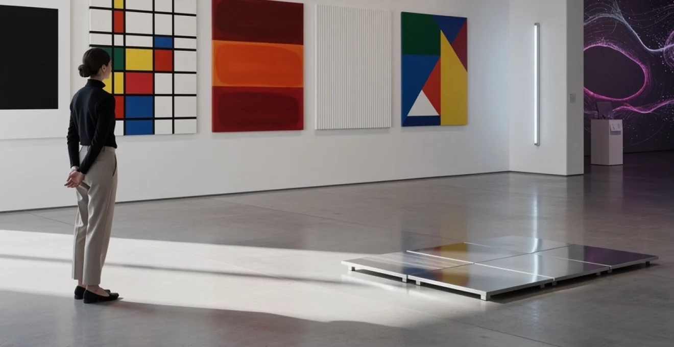
Kazimir malevich’s black square and the birth of geometric abstraction
When Kazimir Malevich exhibited his “Black Square” in 1915, he created what many consider the zero point of painting—a work so reduced that it seemed to annihilate traditional artistic values entirely. This simple black square on a white background represented the culmination of Suprematist philosophy, which sought to liberate art from objective representation and elevate pure geometric form to supremacy. Malevich’s work demonstrated that a painting needn’t depict anything beyond its own material existence to be profoundly meaningful. The Black Square functioned as both an ending and a beginning: the death of representational art and the birth of an entirely new visual language based on geometric purity.
Suprematism’s influence on later minimalist movements cannot be overstated. By demonstrating that a simple geometric shape could carry philosophical and emotional weight, Malevich established the foundational principle that form itself—divorced from representation—could be art’s primary content. This radical proposition freed subsequent generations to explore reduction as a legitimate artistic strategy rather than a limitation.
Piet mond
Piet mondrian’s Neo-Plasticism and the de stijl grid system
Piet Mondrian advanced the project of minimalist art by refining geometry into an almost musical system of verticals, horizontals, and primary colours. His Neo-Plasticism, developed in the 1910s and 1920s, sought universal harmony through strict compositional rules: only right angles, only primary colours (red, blue, yellow), and non-colours (white, black, grey). By limiting his visual vocabulary so rigorously, Mondrian transformed painting into a kind of abstract architecture, where balance and tension between coloured rectangles mirrored an ideal social and spiritual order.
The De Stijl movement, which Mondrian co-founded, extended this grid system beyond canvas into furniture, typography, and architecture, demonstrating how minimalist art could become a holistic visual language. What might appear at first glance as simple coloured boxes reveals, upon closer inspection, a sophisticated orchestration of proportion, rhythm, and asymmetry. This compositional discipline continues to inform contemporary minimalist design, from user interfaces to interior layouts, where clarity and hierarchy rely on grid-based structures. In this sense, Mondrian’s minimalist art became a blueprint for modern visual communication.
Mark rothko’s chromatic rectangles and emotional resonance through form
Although Mark Rothko is often associated with Abstract Expressionism rather than minimalism, his later work plays a crucial role in the story of minimalist art. Rothko’s large canvases of floating chromatic rectangles reduce imagery to fields of colour, removing identifiable figures or narrative content. By stripping painting down to softly edged blocks of pigment, he created immersive environments where viewers confront the raw emotional impact of hue, saturation, and scale. The simplicity of the format—usually two or three stacked rectangles—belies the depth of feeling they can evoke.
Rothko’s work demonstrates how minimalist art can communicate profound emotion without explicit subject matter. When you stand close to a Rothko, the painting seems to envelop your peripheral vision, transforming colour into a spatial and psychological experience rather than a decorative surface. This focus on atmosphere rather than representation anticipates later minimalist strategies, where reduced visual elements are used to shape how you feel in a space. In contemporary art and design, the idea that a restrained composition can generate intense emotional resonance remains a central principle of minimalist aesthetics.
Agnes martin’s precise linear compositions and meditative repetition
Agnes Martin pushed minimalist painting toward an almost spiritual quietude through her delicate grids and hand-drawn lines. Working primarily with pale washes of colour and graphite on canvas, she created compositions that appear at first to be mechanically produced, yet reveal subtle irregularities upon closer inspection. These faint horizontal and vertical lines, often barely visible, structure the pictorial space into evenly spaced bands or squares, suggesting order while preserving a human trace. Her work balances precision with vulnerability, offering a compelling model for minimalist art that is both rigorous and deeply personal.
Martin described her paintings as meditations on happiness, innocence, and tranquillity, showing that minimalist art could be a vehicle for introspection rather than cold detachment. The repetitive linear structures operate like visual mantras, encouraging you to slow your gaze and attune to minor shifts in tone and texture. In many ways, her work prefigures contemporary trends in calming, minimalist interiors and wellness-focused design, where repetition and subtle variation foster a sense of stability and peace. Through Martin, we see how reduction and repetition can become tools for creating contemplative visual experiences in both art and everyday environments.
Gestalt principles and cognitive processing in minimalist compositions
Minimalist art’s apparent simplicity conceals a sophisticated engagement with how we perceive visual information. Gestalt psychology, developed in the early twentieth century, proposes that we naturally organize visual stimuli into coherent wholes rather than isolated parts. Minimalist artists intuitively exploited these principles—such as proximity, similarity, closure, and figure-ground—to guide your perception with minimal means. By carefully arranging basic forms, they encourage your brain to “complete” the image, transforming sparse compositions into rich perceptual events.
Because minimalist compositions strip away distraction, Gestalt effects become especially pronounced. You might see a sequence of identical modules as a continuous rhythm, or a single interruption in a grid as a focal point. This cognitive economy is part of why minimalist art feels so direct and legible, even when it’s conceptually complex. For contemporary visual communication—from branding to interface design—these same principles inform how minimal layouts can remain intuitive, accessible, and emotionally engaging without visual clutter.
Figure-ground relationships in donald judd’s Three-Dimensional works
Donald Judd’s sculptural objects, which he preferred to call “specific objects,” are exemplary studies in figure-ground dynamics. His serial arrangements of boxes, stacks, and progressions use industrial materials and precise fabrication to clarify the relationship between solid form and surrounding space. Rather than treating sculptures as independent figures on a neutral pedestal, Judd integrates them into the environment so that walls, floor, and voids become active components of the work. The boundary between artwork (figure) and architecture (ground) becomes fluid and negotiable.
When you encounter a Judd stack mounted on a wall, for instance, the regular intervals of metal units create alternating bands of presence and absence. Your eye oscillates between the coloured boxes and the empty wall between them, making negative space as perceptually vivid as the objects themselves. This heightened awareness of figure-ground relationships is central to minimalist visual communication, where content and empty space work together to direct attention. In many minimalist interiors and product designs, similar strategies ensure that what is not there is as meaningful as what is.
Negative space manipulation in ellsworth kelly’s Hard-Edge abstractions
Ellsworth Kelly’s paintings and reliefs refine minimalist art to crisp planes of colour and sharply defined contours, using negative space as an active design element. His hard-edge abstractions often feature a single bold form—such as a curved wedge or angular block—set against a monochrome ground. On their own, these shapes might seem straightforward, but Kelly carefully calibrates their placement so that the surrounding empty space becomes compositionally charged. The result is a balanced tension where the background feels almost sculptural.
Kelly’s work illustrates how minimalist art can manipulate negative space to create dynamic visual experiences with minimal elements. You might notice how a single curve seems to push against the canvas edge, or how a gap between two colours feels like a physical interval rather than mere emptiness. This sensitivity to negative space directly informs contemporary minimalist branding and layout design, where generous margins and whitespace enhance readability and perceived luxury. In effect, Kelly teaches us that what you leave blank can speak as loudly as what you choose to depict.
Perceptual psychology behind dan flavin’s fluorescent light installations
Dan Flavin redefined minimalist art by using commercially available fluorescent tubes as his sole medium, transforming galleries into luminous fields of colour. Rather than painting with pigment, Flavin painted with light itself, arranging fixtures in simple configurations—corner pieces, wall runs, or cross-shaped structures—that bathe the surrounding architecture in coloured glow. Viewers do not just look at these works; they inhabit them, as coloured light alters spatial perception, depth cues, and even bodily awareness. This immersive quality makes Flavin’s installations a key reference point for both minimalist and experiential art.
From a perceptual psychology perspective, Flavin’s work demonstrates how limited inputs can produce complex sensory outcomes. Different wavelengths of light interact with surfaces and with your vision, causing afterimages, subtle shifts in hue, and changing spatial impressions as you move. The minimal physical forms of the tubes contrast with the expansive, intangible effects they generate in space. Contemporary digital installations and LED-based artworks follow this logic, using minimal hardware to engineer rich perceptual environments—an approach that continues to influence lighting design, retail environments, and minimalist public art.
Visual hierarchy through monochromatic palettes and geometric reduction
One of minimalist art’s most powerful tools is the creation of clear visual hierarchy using very few elements. By limiting the palette to one colour or closely related tones, artists can emphasize subtle shifts in value, saturation, and scale. Geometric reduction—relying on circles, squares, lines, or rectangles—ensures that viewers are not distracted by representational details. Instead, the eye naturally gravitates toward contrasts in size, position, or intensity, establishing an implicit order within the composition.
This approach is analogous to a well-structured sentence in which word order and emphasis guide meaning without ornate language. In a monochrome painting, a slightly darker band may function as a visual subject, while lighter surrounding areas act as supporting clauses. Designers apply similar principles in minimalist interfaces and presentations, using typography, spacing, and restrained colour to direct user attention efficiently. For anyone working with visual communication today, studying how minimalist artists construct hierarchy with almost nothing is an invaluable way to learn how simplicity can clarify complex information.
Material honesty and industrial fabrication techniques
Beyond composition and colour, minimalist art places strong emphasis on material honesty—the idea that a material should appear and behave as itself, without illusionistic disguise. Rather than using paint to simulate depth, texture, or other substances, minimalist artists often foreground the inherent properties of metal, wood, concrete, glass, or fluorescent light. This commitment aligns with broader modernist ethics in architecture and design, where structural elements and industrial fabrication processes are exposed rather than concealed. In minimalist art, the process of making and the qualities of matter are not hidden backstage; they become central to the work’s meaning.
This embrace of industrial fabrication also speaks to a shift in authorship and labour. Many minimalist artists worked with fabricators or manufacturers, specifying dimensions, materials, and finishes while delegating actual production. The resulting objects are precise, repeatable, and often modular, echoing the standards of mass production. For contemporary creators and collectors interested in minimalist aesthetics, this legacy suggests a different way of thinking about craftsmanship and value—one where conceptual clarity, material integrity, and technical execution carry as much weight as traditional notions of hand-made artistry.
Carl andre’s unaltered metal plates and Anti-Illusionistic surfaces
Carl Andre took material honesty to an extreme by presenting industrial components with minimal alteration. His floor sculptures—composed of unmodified metal plates arranged in grids or linear sequences—invite you to walk on the artwork, collapsing the distance between viewer and object. There is no pedestal, no carving, no visible gesture of the artist’s hand; instead, the work consists of simple placement and arrangement. The metal remains recognizably itself, with factory finishes, scratches, and oxidation included as part of the visual experience.
Andre’s anti-illusionistic surfaces challenge traditional expectations that art should transform materials into something else. Instead of representing space, his works literally occupy it, redefining how you move through and perceive the gallery. This radical minimalism has influenced contemporary approaches to installation, urban sculpture, and even minimalist interior flooring, where the pattern and presence of basic modules shape experience. By reducing intervention to selection and ordering, Andre shows how minimalist art can shift our awareness of ordinary materials without embellishment.
Sol LeWitt’s wall drawings and conceptual execution parameters
Sol LeWitt brought a conceptual dimension to minimalist practice by separating the idea of the work from its physical execution. His wall drawings are defined by written instructions—such as “four arcs from the corners” or “lines from the center to the points on the edge of the wall”—that can be carried out by assistants or technicians. The resulting works often consist of simple geometric lines, grids, or colour bands, yet their true essence lies in the generative rule rather than the finished image. This shift foregrounds the logic and structure behind minimalist art, turning composition into a kind of algorithm.
LeWitt’s reliance on execution parameters prefigures contemporary digital and generative minimalism, where code rather than brushwork determines outcomes. It also raises intriguing questions for collectors and institutions: what exactly is being acquired—the instructions, the drawing, or the right to recreate it? For designers and artists today, LeWitt’s approach offers a powerful analogy: a clear, repeatable system can yield infinite variations while preserving a coherent minimalist aesthetic. In many ways, his work bridges the gap between mid-century minimalism and current data-driven visual culture.
Anne truitt’s Hand-Painted wooden columns and craftsmanship precision
In contrast to industrially fabricated minimalism, Anne Truitt’s sculptural columns emphasize meticulous handcraft and painterly sensitivity within a reduced formal vocabulary. Her tall, rectangular wooden forms are coated with multiple layers of delicately modulated colour, sanded and repainted until the surfaces achieve a luminous, almost skin-like depth. At a distance, these works read as simple colour planes; up close, you can see traces of brushwork, edges of tape lines, and slight irregularities that affirm the presence of the artist’s hand.
Truitt’s practice demonstrates that minimalist art need not reject craftsmanship or emotion to maintain formal clarity. The precise geometry of her columns provides a stable framework, while subtle colour changes and surface variations introduce nuance and intimacy. This blend of structural simplicity and material refinement has become a touchstone for contemporary makers who aim to combine minimalist design with artisanal skill—whether in furniture, architectural details, or bespoke acoustic panels. Truitt shows that “less” can still be deeply tactile, personal, and time-intensive.
Spatial dynamics: site-specificity and architectural integration
As minimalist art evolved, many practitioners moved beyond discrete objects to engage directly with architectural space. Rather than treating the gallery as a neutral container, they considered it an integral component of the work. This emphasis on site-specificity—creating art for a particular location, scale, and light condition—intensifies the spatial dynamics of minimalist compositions. Walls, floors, ceilings, and even circulation paths become part of the artistic field, transforming how you navigate and inhabit the space.
In practice, this means that minimalist installations often cannot be fully appreciated through photographs alone; they require embodied experience. A row of identical columns might subtly compress a corridor, while a monochrome wall painting can recalibrate your sense of proportion in a room. Architects and interior designers have drawn extensively from these strategies, using minimalist interventions to guide movement, frame views, and create zones of calm within busy environments. For anyone planning a minimalist space, understanding these spatial dynamics is key to making simplicity feel intentional rather than empty.
Contemporary digital minimalism: from james turrell to refik anadol’s data sculptures
In the twenty-first century, minimalist art has expanded into digital and immersive realms, yet its core principles remain recognizable. James Turrell’s light and space works, for example, use carefully controlled illumination and architectural modifications to reduce visual input to pure colour and gradient. In his Ganzfeld installations, boundaries between floor, wall, and ceiling dissolve, leaving you suspended in an apparently infinite field of light. Although Turrell often works with advanced technology and engineering, the perceptual result aligns with minimalist values: clarity, reduction, and focused attention on the fundamentals of seeing.
Refik Anadol’s data sculptures push this evolution further by translating massive datasets—such as weather patterns or neural activity—into abstract digital visuals projected onto architectural surfaces. While the underlying information is complex, the resulting forms often adhere to minimalist aesthetics: flowing fields of colour, geometric structures, and rhythmic repetition. Here, minimalism becomes a lens through which we can comprehend otherwise overwhelming information, turning raw data into legible, emotionally resonant experiences. The screen or facade becomes a canvas, and algorithms replace brushes, but the ambition is familiar: to say more with less.
For contemporary visual communicators, this digital minimalism offers practical lessons. Whether you design interfaces, motion graphics, or interactive installations, the most effective solutions often rely on restrained palettes, clear hierarchy, and deliberate use of empty space. Minimalist art, from Malevich’s Black Square to Anadol’s data-driven projections, demonstrates that simplicity is not the absence of content but a strategy for intensifying meaning. As our visual environment grows ever more crowded, the ability to speak volumes through simplicity becomes not just an artistic preference, but a critical skill in how we shape and understand the world around us.