The interplay between light and shadow forms the very foundation of visual perception and artistic representation. From the earliest cave paintings to contemporary digital art, artists have grappled with translating three-dimensional reality onto two-dimensional surfaces through the careful observation and manipulation of tonal values. Understanding how light behaves—how it illuminates, reflects, absorbs, and casts shadows—unlocks the ability to create convincing depth, establish mood, and guide viewer attention with precision. Whether you’re working with traditional media or digital tools, mastering the principles of chiaroscuro, value mapping, and directional lighting transforms competent artwork into compelling visual narratives that resonate with emotional and psychological impact.
The technical aspects of rendering light and shadow extend far beyond simple shading techniques. They encompass understanding the geometric relationships between light sources and forms, the atmospheric conditions that affect luminosity, and the cultural and philosophical approaches to tonal composition developed across centuries. For contemporary artists, these classical principles merge seamlessly with cutting-edge digital technologies, creating unprecedented opportunities for controlling every nuance of illumination in your compositions.
Chiaroscuro techniques in renaissance and baroque painting
Chiaroscuro, derived from the Italian words for light (chiaro) and dark (scuro), represents one of the most influential artistic innovations in Western art history. This technique employs dramatic contrasts between illuminated and shadowed areas to create volume, depth, and emotional intensity. Masters of the Renaissance and Baroque periods elevated chiaroscuro from a mere rendering technique to a powerful compositional and narrative device that fundamentally changed how artists approached their subjects.
The psychological impact of strong tonal contrasts cannot be overstated. When you observe a painting employing sophisticated chiaroscuro, your eye naturally follows the path of light, creating a visual hierarchy that directs attention precisely where the artist intends. This manipulation of viewer focus through controlled illumination remains as relevant in contemporary visual communication as it was five centuries ago, whether you’re creating oil paintings, digital illustrations, or photographic compositions.
Caravaggio’s tenebrism and dramatic light contrast
Michelangelo Merisi da Caravaggio pushed chiaroscuro to its extreme conclusion through tenebrism, a technique characterised by violently contrasting light and profound darkness. Unlike the gradual tonal transitions favoured by earlier Renaissance masters, Caravaggio’s approach featured figures dramatically illuminated against nearly black backgrounds, as though a single powerful light source pierced absolute darkness. This theatrical lighting created an unprecedented sense of immediacy and psychological intensity that revolutionised Baroque painting.
Tenebrism achieves its dramatic effect through several technical considerations. The deepest shadows contain virtually no detail or reflected light, forcing the illuminated areas to carry the entire narrative weight of the composition. When you examine Caravaggio’s works, notice how the light reveals only essential forms and expressions whilst everything deemed superfluous disappears into shadow. This selective revelation creates mystery and focuses attention with surgical precision. Modern photographers and cinematographers continue employing these exact principles when crafting high-contrast imagery for dramatic effect.
Rembrandt’s layered glazing method for luminous shadows
Rembrandt van Rijn approached chiaroscuro from a different technical direction, developing a complex layering technique that created shadows with remarkable depth and luminosity. Rather than applying opaque dark pigments directly, Rembrandt built his shadows through multiple transparent glazes over lighter underpaintings. This method allowed light to penetrate the paint layers, reflect off the lighter colours beneath, and travel back through the glazes, creating shadows that appeared to glow from within.
The technical sophistication of Rembrandt’s approach required extraordinary patience and understanding of oil paint properties. Each glaze layer needed sufficient drying time before the next application, sometimes requiring weeks or months to complete a single painting. When you study Rembrandt’s portraits under proper lighting conditions, you’ll observe that even his darkest shadows contain subtle variations and a sense of atmospheric depth absent in flatly painted dark areas. This luminous shadow quality creates a sense of three-dimensional reality that transcends mere technical competence and enters the realm of perceptual magic.
Leonardo da vinci’s sfumato and atmospheric perspective
extends beyond the modelling of individual forms and into the realm of atmosphere itself. Leonardo’s sfumato technique, literally meaning “smoky,” relies on imperceptibly soft transitions between light and shadow, eliminating hard outlines. Instead of defining a cheek or a jaw with a crisp contour, he allowed values to shift gradually, mirroring how we actually perceive faces through a veil of air and ambient light. This approach contributes to the enigmatic expressions in works like the Mona Lisa, where slight value shifts suggest subtle emotional nuance.
Closely related is Leonardo’s use of atmospheric perspective, where distant objects appear lighter, cooler, and less distinct due to particles in the air scattering light. By carefully adjusting tonal values and edges from foreground to background, he created convincing depth without relying solely on linear perspective. When you apply this in your own compositions, think of the background as being seen through a gentle mist: soften edges, compress contrast, and nudge values closer together. The result is a more believable sense of space and a natural hierarchy that draws the eye first to high-contrast focal areas.
Vermeer’s north light studio setup and tonal modelling
Johannes Vermeer approached light and shadow with almost scientific precision, taking full advantage of consistent north-facing daylight in his studio. North light changes minimally throughout the day and avoids the harsh extremes of direct sun, producing soft, stable illumination ideal for subtle tonal modelling. Vermeer used this controlled directional lighting to sculpt figures, fabrics, and interiors with quiet but powerful chiaroscuro. The result is a calm, contemplative atmosphere where even mundane activities seem imbued with significance.
Vermeer’s method offers practical lessons for any artist seeking realistic light and shadow in painting or photography. By keeping the light source consistent and indirect, he avoided distracting hotspots and deep, detail-killing shadows, allowing midtones and halftones to carry much of the visual information. If you work from life, positioning your model or still life near a large, diffused window on the shadow side of the room can mimic this “north light” effect. In digital art, you can achieve a similar look by using a broad, soft light source and gently restraining your contrast, reserving your sharpest highlights and darkest shadows for compositional accents.
Directional lighting principles in visual composition
Once we move from historical examples to general practice, the direction of light becomes one of the most powerful tools in visual composition. Directional lighting principles determine how forms read, how textures appear, and how viewers emotionally respond to an image. A single subject can look serene, sinister, or heroic depending entirely on where the light comes from and how shadows fall. Understanding these lighting strategies helps you design not just realistic images, but intentional visual narratives that communicate clearly.
Whether you are painting, photographing, or working in 3D, thinking like a lighting designer elevates your work. Rather than accepting whatever light happens to be available, you can choose lighting setups that reinforce your conceptual goals. Ask yourself: do you want to reveal every plane of a form, or conceal part of it in dramatic shadow? Should your subject feel approachable and soft, or distant and stark? Directional lighting is the answering mechanism to these questions, providing concrete ways to shape artistic compositions with light and shadow.
Rim lighting and edge definition in figure studies
Rim lighting, sometimes called backlighting, occurs when a light source is positioned behind a subject, creating a bright edge of light along the contour. In figure studies, this technique is invaluable for edge definition, especially when the subject overlaps a dark or similarly toned background. That narrow halo of light instantly separates the figure from its surroundings, clarifying silhouette and enhancing three-dimensional form. You will often see rim light used in portrait photography, cinematic stills, and concept art to add a subtle yet powerful sense of drama.
Practically, rim lighting forces you to think carefully about value grouping and contrast control. If both your figure and your background are mid to dark values, the rim becomes the brightest accent and naturally attracts the eye. For life drawing, positioning a lamp behind and slightly to the side of the model can give you clear edges to study while still preserving core shadows and halftones on the front planes. In digital painting, adding a controlled rim light—without overdoing its intensity—can be the visual equivalent of underlining important shapes, helping your composition read clearly even at a small thumbnail size.
Three-point lighting configuration for sculptural form
The classic three-point lighting configuration—key light, fill light, and back light—originated in film and photography but applies equally well to painting and digital illustration. The key light is your primary source, establishing the dominant direction of light and the main cast shadows. A softer fill light reduces contrast in the shadow areas without eliminating them entirely, preserving form while avoiding overly harsh chiaroscuro. The back light, often subtle, helps separate the subject from the background, adding a hint of rim or edge light.
Why is this setup so widely used in visual composition? Because it balances clarity and drama. You get enough directional light to model sculptural form, yet enough fill to retain detail in the shadows, and just enough backlight for separation. When you design a scene—whether in oils, graphite, or 3D—try mentally assigning these roles to your light sources. Even if you only physically use two lights, thinking in terms of key, fill, and back helps you create believable, readable lighting that supports the story you want to tell.
Contre-jour effects and silhouette photography
Contre-jour, a French term meaning “against the day,” describes shooting or painting directly into the light source so that the subject appears mostly in shadow. In photography, this often creates a bold silhouette effect, where internal details are minimized and the outline becomes the primary design element. The result can be strikingly graphic, transforming ordinary subjects—trees, figures, architecture—into powerful shapes. For artists focusing on how light and shadow shape compositions, contre-jour is a masterclass in value simplification.
Working contre-jour forces you to prioritize composition, negative space, and edge quality over local color and surface detail. Because your subject is largely dark against a bright background, small variations in the contour line become incredibly important. This approach aligns closely with notan design principles, where the balance of light and dark shapes takes precedence over everything else. Next time you are outside near sunrise or sunset, try studying scenes with the sun directly in front of you: notice how forms collapse into silhouettes, and ask how you might use that dramatic effect in your own visual storytelling.
Raking light techniques for texture revelation
Raking light occurs when illumination strikes a surface at a very low angle, almost skimming across it. This directional lighting exaggerates small bumps, grooves, and irregularities by casting tiny shadows, making texture much more visible. Conservators and art historians frequently use raking light to examine brushwork, surface damage, or hidden details in paintings. As artists, we can adopt the same principle to better understand how texture behaves and how to render it convincingly.
If you are painting a weathered wall, aged skin, or rough fabric, observing your subject under raking light reveals structures that front lighting would flatten. In the studio, simply moving a lamp to the side of your still life or model can transform your understanding of the form. In digital workflows, a low-angle light pass in 3D software or a strongly angled “test light” layer in painting software can help you design texture before committing to final shading. Think of raking light as the equivalent of running your fingers across a surface with your eyes closed—it makes subtle variations suddenly obvious.
Tonal value mapping and notan design philosophy
Beyond the physical behavior of light, successful compositions depend on how you organize tonal values across the entire image. Tonal value mapping is the deliberate planning of light, midtone, and shadow patterns to lead the viewer’s eye and maintain visual coherence. Notan design—rooted in Japanese aesthetics—takes this even further by reducing a scene to a few interlocking shapes of light and dark. By thinking in terms of simplified value relationships before you worry about detail or color, you create a strong underlying structure that can support complex surfaces and narratives.
Many contemporary artists, illustrators, and photographers now treat value mapping as an early, non-negotiable stage in their workflow. Why? Because a piece with a solid value structure remains readable at any size, in any medium, and even when converted to grayscale. Training yourself to see and design with values is like learning the skeleton beneath the skin: once you internalize it, every artistic decision becomes more intentional. Whether you are planning a high-contrast chiaroscuro scene or a soft, low-key study, value mapping ensures light and shadow work together instead of competing.
Japanese notan compositional balance principles
Notan, often translated as “light-dark harmony,” comes from Japanese art and design traditions where the interplay of positive and negative space is paramount. In a classic Notan study, you reduce a scene to just two or three flat values—usually black, white, and sometimes a midtone gray. The purpose is not realism but balance: you are composing with abstract shapes of light and shadow, testing how they lock together across the page. This practice reveals whether your composition has a clear, impactful structure before you invest time in rendering.
Practically, you can explore Notan by cutting black paper on white ground, using ink and brush, or working digitally with hard-edged value blocks. Ask yourself: if my subject were only a silhouette and a few internal shapes, would the design still read? Does the pattern of darks lead the eye, or does it fragment into confusion? By repeatedly simplifying scenes into Notan, you develop an intuitive feel for compositional balance, which then informs your more detailed light and shadow decisions later in the process.
Munsell value scale application in fine art
The Munsell value scale offers a systematic way to understand and control tonal values, dividing them into nine or ten distinct steps from pure black to pure white. Many ateliers and academic art programs still rely on Munsell charts to train students’ eyes, because assigning a numeric value to a tone removes some of the guesswork. When you say a shadow is “around value 3” and a highlight is “around value 8,” you are already quantifying contrast in a clear, replicable way. This helps tremendously when you want consistent results across multiple paintings or digital works.
Applying the Munsell value scale in fine art can be as simple or as complex as you need. At a basic level, you might premix or preselect a limited set of values and restrict yourself to them, much like a musician practicing within a single key. More advanced artists use printed or digital value scales to compare directly with their subject, checking whether a particular area is lighter or darker than they initially thought. Over time, this disciplined approach sharpens your perception of subtle differences between halftones and reflected lights, leading to more convincing and intentional shading.
Thumbnailing and value sketch strategies
Thumbnail sketches—small, quick drawings that focus on big shapes—are one of the most effective tools for planning value structure. By stripping away detail and color, you can test various arrangements of lights and darks in minutes rather than hours. Many professionals create a series of four to twelve tiny value thumbnails before committing to a final composition. This iterative process lets you explore different focal points, lighting scenarios, and Notan patterns with minimal investment.
Value sketches can be done traditionally with markers, graphite, or ink washes, or digitally using simple brushes and a restricted grayscale palette. Aim to establish three to five main value groups, resisting the temptation to overcomplicate. Ask yourself which area should be the brightest “stage” for your subject and where your darkest accents will sit in relation to that. Treat these thumbnails as experiments: by comparing them side by side, you quickly see which arrangement of light and shadow creates the strongest, most readable composition.
Gamut masking for controlled tonal range
Gamut masking is often discussed in relation to color, but the same principle applies beautifully to tonal values. The idea is to deliberately limit your available range—your “gamut”—so that the resulting image feels unified and controlled. Instead of using pure black and pure white in every piece, you might decide that your darkest dark will be a Munsell value 2 and your lightest light a value 8. This compressed value range can create a cohesive mood, especially in atmospheric or contemplative works.
In practice, you can create a simple “value mask” for yourself: a small chart of allowed values taped to your easel or pinned in your digital workspace. Before you start, choose which steps you will use and which you will omit. Much like limiting your musical notes to create a specific key, limiting your values gives your light and shadow a distinct character. Interestingly, occasional strategic breaks from this mask—such as introducing a single, slightly brighter highlight at the focal point—can become incredibly powerful because they contrast with the established system.
Cast shadow geometry and perspective accuracy
While value design shapes the overall composition, the geometry of cast shadows grounds objects convincingly in space. Inaccurate cast shadows are one of the quickest ways to break the illusion of realism, especially for viewers who may not consciously know why something feels “off.” Cast shadows follow strict geometric rules based on the light source position, the orientation of objects, and the perspective system of the scene. Understanding these relationships allows you to construct believable shadows even when you are working from imagination rather than direct observation.
Think of a cast shadow as the projection of a form onto another surface, much like a slide projector casting an image on a wall. The light rays act as “projectors,” radiating from the source and intersecting the contours of the object before hitting the ground plane or background. In linear perspective, these rays can be traced back to a light vanishing point, often located above or to the side of the horizon line, depending on the setup. By defining a clear ground plane, horizon, and light direction, you can systematically plot where key points of the object will fall in shadow, resulting in cast shadows that reinforce, rather than contradict, your perspective.
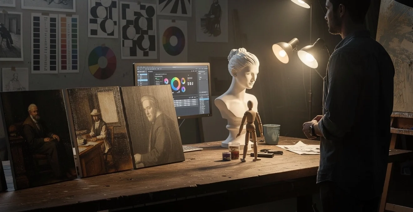
Digital light simulation in contemporary art production
With the rise of powerful software and hardware, digital light simulation has become a core part of contemporary art production. Concept artists, illustrators, and 3D specialists now routinely use virtual lights to test and refine their compositions. Accurate digital lighting allows creators to preview how shadows wrap around forms, how reflections behave, and how atmospheric effects change perceived depth. In many pipelines, artists first block out scenes in 3D with basic materials and lights, then paint over rendered images to combine realism with expressive stylization.
These tools do not replace traditional knowledge of light and shadow; they amplify it. When you understand chiaroscuro, value mapping, and directional lighting, software becomes a sophisticated assistant rather than a crutch. You can quickly iterate through multiple lighting scenarios, evaluate which best supports your narrative, and fine-tune subtle elements like bounce light or specular highlights. The result is a workflow where classical principles and cutting-edge technology work hand in hand to shape compelling artistic compositions.
HDRI environment mapping for photo-realistic rendering
High Dynamic Range Imaging (HDRI) environment mapping is a technique that uses 360-degree, high-bit-depth photographs of real-world lighting environments to light 3D scenes. Instead of manually placing multiple lights to approximate reality, you wrap an HDRI map around your virtual world, allowing it to provide complex, directionally accurate illumination. This includes subtle color shifts, soft and hard shadow interplay, and realistic reflections in glossy or metallic surfaces. For artists working in visualization, product design, or cinematic concept art, HDRI-based lighting can dramatically accelerate the path to photorealistic rendering.
HDRIs excel at capturing outdoor light and interior spaces where light bounces multiple times before reaching the subject. When you load such an environment map into your 3D software, you instantly gain a believable base lighting setup that you can tweak with additional artificial lights if needed. Even if you eventually paint over the render, starting from an HDRI-lit model gives you a credible foundation for how light and shadow behave on complex forms. It is similar to placing your still life in a specific real-world location and then building your painting around that established lighting scenario.
Global illumination algorithms in 3D software
Global illumination (GI) algorithms simulate the way light bounces off surfaces and indirectly illuminates other parts of a scene. Unlike simple direct lighting, which only accounts for rays traveling straight from a light source to an object, GI considers multiple reflections, color bleeding, and soft ambient effects. This secondary lighting is what makes a sunlit room feel full of gentle, realistic light rather than harshly spotlit. Modern render engines like V-Ray, Arnold, and Cycles rely heavily on GI to achieve convincing images that obey physical light behavior.
For digital artists, understanding the basics of global illumination helps you diagnose and control the mood of your scenes. If your render looks flat or “computer-generated,” you might be missing sufficient indirect light or appropriate bounce from nearby surfaces. Conversely, if everything feels washed out, you may need to dial back GI intensity or increase contrast locally with additional lights or post-processing. Even when painting from scratch, thinking in GI terms—imagining how light bounces from warm walls onto a character’s skin, for instance—leads to richer, more integrated light and shadow relationships.
Photoshop dodge and burn layer techniques
In digital painting and photo editing, dodge and burn techniques are the modern counterpart to classical value adjustment, allowing you to sculpt light and shadow after the fact. Instead of using destructive tools directly on your image layer, many professionals prefer non-destructive setups: for example, creating a new layer filled with 50% gray set to Soft Light or Overlay blending mode. Painting with a soft white brush on this layer “dodges” (lightens) underlying areas, while painting with black “burns” (darkens) them. This approach lets you reshape value structure without compromising color information.
Used thoughtfully, dodge and burn can refine focal points, emphasize form, and unify contrast across complex compositions. You might subtly brighten a character’s face while deepening the surrounding environment to increase separation, or darken edges of the frame to create a vignette that guides the eye inward. The key is restraint and reference to believable light behavior: ask yourself where the actual light source is and whether your adjustments support or contradict it. When combined with solid knowledge of chiaroscuro and value mapping, dodge and burn becomes a precision instrument for fine-tuning the emotional and spatial impact of your work.
Psychological impact of high-key versus low-key lighting
Beyond physical realism and compositional clarity, lighting choices profoundly influence how viewers feel about an image. High-key lighting, characterized by predominantly light values and gentle contrast, often suggests openness, optimism, or delicacy. Think of softly lit fashion photography, bright children’s book illustrations, or serene interior scenes where shadows are minimal. Low-key lighting, by contrast, uses large areas of deep shadow and strong highlights to evoke mystery, tension, or introspection, echoing the tenebrist drama of Caravaggio and film noir cinematography.
When you design the light and shadow structure of a piece, you are also designing its emotional resonance. Do you want the viewer to feel comforted, energized, unsettled, or intrigued? A high-key scene with just a few understated shadows can convey clarity and safety, making it ideal for communicating transparency or joy. A low-key scene with rich, enveloping darkness invites the viewer to peer into the unknown, making it perfect for narratives about secrecy, conflict, or inner turmoil. By consciously selecting a high-key or low-key approach—and perhaps blending them strategically across a series—you harness lighting as a psychological language, turning tonal values into tools for storytelling as much as for realism.