Calligraphy stands at a fascinating crossroads where centuries-old craftsmanship meets cutting-edge digital innovation. This ancient art form, once reserved for sacred texts and royal decrees, now infuses modern branding, motion graphics, and visual communication with organic warmth and cultural depth. From the ornate scripts adorning medieval manuscripts to the dynamic letterforms animating today’s digital interfaces, calligraphy continues to evolve while retaining its essential character. The resurgence of hand-lettering in contemporary design reflects a broader cultural yearning for authenticity and human touch in an increasingly automated world. As designers seek to differentiate their work and create emotional resonance with audiences, calligraphic traditions offer a rich vocabulary of expressive possibilities that algorithmic type generation simply cannot replicate.
The integration of calligraphy into modern design workflows represents more than nostalgic revival—it signals a sophisticated understanding of how traditional techniques can inform and elevate contemporary visual language. Whether you’re encountering the fluid brushstrokes of East Asian scripts in minimalist packaging, the geometric precision of Islamic calligraphy in architectural branding, or the ornamental flourishes of Copperplate script in editorial design, you’re witnessing the ongoing dialogue between historical mastery and present-day innovation. This synthesis creates visual experiences that honour heritage while speaking directly to contemporary sensibilities.
Historical evolution of calligraphic scripts from medieval manuscripts to digital typography
The journey from quill and parchment to stylus and screen reveals profound continuities alongside radical transformations. Medieval scriptoria established foundational principles of letterform construction, spacing, and hierarchical organization that continue to inform typographic practice today. The painstaking labour of manuscript production—where a single error could ruin weeks of work—cultivated an attention to detail and compositional rigour that resonates with the meticulous craft of contemporary type design. These historical workshops functioned as the first design studios, where teams of specialists collaborated to create unified visual systems centuries before the term « brand identity » entered our vocabulary.
The transition from handwritten manuscripts to movable type in the fifteenth century marked the first major disruption in calligraphic practice, yet rather than eliminating the art form, it transformed its role. Calligraphy shifted from utilitarian communication toward decorative and ceremonial applications, much as it has in response to digital text today. This historical precedent offers valuable perspective on current anxieties about handwriting’s relevance—calligraphy has repeatedly proven its ability to adapt and find new purpose when technological change renders previous functions obsolete. The art form’s resilience stems from its capacity to convey qualities beyond mere legibility: personality, cultural identity, and emotional nuance that standardized type cannot fully capture.
Carolingian minuscule and foundational hand techniques in european lettering heritage
Carolingian minuscule, developed in the ninth century during Charlemagne’s cultural revival, established structural principles that underpin Western typography to this day. This script’s emphasis on clear letterforms, consistent spacing, and balanced proportions created a template for readability that influenced everything from Renaissance humanist scripts to twentieth-century typefaces like Gill Sans and Optima. The foundational hand techniques taught in calligraphy education—the specific pen angle, stroke sequence, and letter spacing—train the eye to recognize subtle relationships between form and counter-form that translate directly into more sophisticated digital type choices.
Contemporary designers who study these historical scripts develop an intuitive understanding of typographic anatomy that elevates their work. When you grasp why Carolingian scribes constructed their letterforms in specific ways—balancing durability with speed, clarity with economy—you gain insight into the eternal tensions that shape all effective typography. Edward Johnston’s twentieth-century revival of foundational hand techniques didn’t merely preserve historical knowledge; it provided a systematic pedagogy for understanding letterform construction that remains relevant whether you’re sketching with a broad-edged pen or manipulating vectors in design software.
Islamic calligraphy: kufic, naskh, and thuluth scripts in contemporary visual communication
Islamic calligraphic traditions offer particularly compelling examples of how ancient scripts thrive in modern contexts. Kufic script, with its angular geometric construction, translates remarkably well to contemporary minimalist aesthetics and architectural applications. The stark, bold letterforms resonate with modernist sens
ibilities, making it a natural fit for logos, wayfinding systems, and even digital icons. Designers often abstract Kufic structures into grid-based patterns, allowing Arabic calligraphy to function simultaneously as text and as a powerful visual motif. In contrast, Naskh and Thuluth scripts bring fluidity and spiritual resonance to editorial layouts, exhibition graphics, and interface design, where their flowing curves can soften the otherwise rigid geometry of digital environments.
Modern practitioners of Arabic calligraphy frequently collaborate with brands, cultural institutions, and architects to create work that operates on multiple levels. A Thuluth inscription might be digitised, vectorised, and then integrated into environmental graphics, wayfinding systems, or responsive web layouts. The result is contemporary visual communication that carries the emotional weight of sacred manuscripts while remaining accessible to audiences who may not read Arabic at all. Here, calligraphy functions less as legible text and more as a cultural signifier—what we might call a “visual accent” that immediately signals heritage, depth, and authenticity.
East asian brushwork traditions: kaisho, gyōsho, and sōsho styles in modern applications
East Asian calligraphy—particularly Chinese, Japanese, and Korean brushwork—offers another rich lineage of styles that adapt remarkably well to contemporary design contexts. Kaisho (standard script) is characterised by its clear, structured strokes and is often used in brand marks or signage where legibility is paramount. Gyōsho (semi-cursive) occupies a middle ground, retaining recognizable character forms while introducing rhythm and flow that feel especially at home in editorial layouts and packaging design. Sōsho (cursive) pushes abstraction further, creating gestural marks that can be read as pure form, not unlike abstract expressionist painting.
For today’s designers, these brush scripts provide a vocabulary of movement, texture, and negative space that is hard to simulate with default digital tools. You might see Kaisho-inspired logotypes for tech companies seeking a balance between precision and tradition, or Gyōsho-influenced brush lettering on contemporary tea packaging that suggests both heritage and ease. Sōsho-style strokes often appear in fashion campaigns, poster design, and motion graphics, where a single sweeping gesture can convey speed, spontaneity, or emotional intensity more effectively than a highly polished sans serif. In each case, the historical discipline of brush handling informs the “visual rhythm” that underpins successful modern compositions.
Copperplate and spencerian script influence on contemporary branding typography
In the Western world, pointed-pen scripts like Copperplate and Spencerian have left an indelible mark on contemporary branding and luxury typography. Copperplate, with its precise hairlines, dramatic contrast, and consistent 55-degree slant, emerged in the eighteenth century as a writing style suited to engraving and reproduction. Spencerian, developed in nineteenth-century America, softened these forms into more economical, looping strokes optimised for business correspondence. Today, both are less about everyday practicality and more about signalling refinement, craftsmanship, and personal attention.
Luxury brands, boutique retailers, and wedding industry creatives often rely on Copperplate-inspired logotypes and wordmarks to evoke a sense of exclusivity and timelessness. Think of the way delicate swashes and high contrast strokes instantly suggest “artisanal” or “handcrafted,” even when rendered as vector curves. Spencerian’s flowing rhythm shows up in more approachable yet still elegant brand identities—speciality coffee roasters, stationery brands, and lifestyle products use Spencerian-style scripts to create a friendly, human feel within otherwise minimal layouts. By studying these historical hands, designers can tweak x-height, contrast, and spacing in digital type to achieve that elusive combination of legibility and emotional warmth.
Contemporary calligraphers bridging traditional craftsmanship with modern design
Theoretical knowledge of calligraphic history becomes far more tangible when we look at how contemporary practitioners are actively reshaping the field. Many of today’s most influential calligraphers and lettering artists move fluidly between analog and digital environments, collaborating with global brands while maintaining strong personal practices. Their work demonstrates that calligraphy is not a relic but a living discipline capable of engaging with street culture, film, technology, and editorial design. By understanding their methods, we gain insight into how you might integrate calligraphic thinking into your own projects.
These artists also illustrate a key point: calligraphy’s power lies not only in stylistic nostalgia, but in its ability to communicate identity and emotion in ways that default system fonts simply cannot. Whether they’re transforming city walls into calligraphic canvases, developing campaign visuals for multinational companies, or designing book covers that feel both classic and fresh, their practices embody the blend of tradition and contemporary design this article explores. They show that when calligraphy enters modern workflows, it doesn’t just decorate—it shapes the very voice of visual communication.
Pokras lampas and calligraffiti: street art integration with cyrillic letterforms
Pokras Lampas is one of the most recognisable figures in the global calligraffiti movement, known for fusing street art scale with the rigour of calligraphy. Working primarily with Latin and Cyrillic letterforms, he paints massive typographic compositions across rooftops, facades, and public plazas. His work demonstrates how calligraphy can transcend its historical association with small formats and sacred texts, instead becoming an urban-scale visual language. In this context, calligraphy functions almost like a sonic waveform—rhythmic, dynamic, and immersive—transforming architecture into a medium for writing.
For designers, Lampas’s approach highlights how traditional scripts can be abstracted into patterns and textures without losing their calligraphic DNA. His layered, overlapping strokes inform motion graphics, apparel design, and even interface backgrounds, where fragments of letterforms create depth and movement. By bringing Cyrillic calligraphy into contemporary street culture, he also challenges assumptions about which scripts “belong” in global visual communication. The lesson for your own work? Historical tools and scripts are not confined to polite, small-scale applications—they can scale up dramatically, shaping experiential branding and placemaking.
Seb lester’s commercial lettering for nike, nasa, and apple brand identity
Seb Lester operates at the intersection of traditional craftsmanship and high-profile commercial design. Trained as a type designer, he has created custom lettering and logotypes for brands like Nike, NASA, and Apple, as well as typefaces used in everything from book publishing to user interfaces. His process often begins with pencil sketches or broad-edged pen studies that explore the underlying structure and rhythm of letterforms. These analog explorations then inform precise vector drawings, where every curve and terminal is adjusted for optical balance.
What makes Lester’s work particularly instructive is how he leverages calligraphic principles—consistent angle, stroke modulation, and counterform control—to create marks that feel both engineered and alive. When you see a sports brand’s wordmark he has touched, you may not consciously identify the influence of foundational hand or Italic scripts, yet their discipline is there in the confident curves and balanced spacing. For designers seeking to integrate calligraphy into brand identity systems, Lester’s practice underscores the value of “thinking with the pen first,” even if the final output is a meticulously polished vector logo.
Yukimi annand’s brush lettering applications in editorial and packaging design
Yukimi Annand brings a distinctly contemplative, textural approach to contemporary brush lettering. Drawing on both Western calligraphy training and East Asian sensibilities, she creates compositions where letters sometimes verge on abstraction, functioning as visual texture within a layout. Her work often appears in editorial spreads, book covers, and packaging where the goal is to evoke atmosphere more than strict legibility. You might encounter her expressive brush marks on the label of a premium beverage, in the opening spread of a magazine, or as background texture in poster design.
Annand’s practice illustrates how nuanced variations in pressure, ink flow, and brush speed can produce a wide range of moods—calm, turbulent, playful, austere. When digitised and integrated into design systems, these textures lend a “breathing” quality to otherwise flat surfaces. For designers, the takeaway is clear: by experimenting with brush lettering and then scanning and vectorising selected marks, you can build a library of organic assets that enrich layouts across print and digital platforms. Instead of relying on generic grunge textures, you create typographic surfaces rooted in authentic gestural practice.
Jessica hische’s ornamental typography for wes anderson films and book covers
Jessica Hische is widely known for her ornamental lettering and type-driven illustration, much of it rooted in historical scripts like Copperplate and Roman capitals. Her work for Wes Anderson films, literary publishers, and high-profile brands demonstrates how decorative calligraphic forms can be adapted to tell very contemporary stories. For example, title sequences and promotional materials she has worked on often blend Victorian-era flourishes with modern colour palettes and layout structures, creating a sense of timeless whimsy that aligns perfectly with Anderson’s cinematic worlds.
In book cover design, Hische frequently starts with hand-drawn letterforms that reference historical calligraphy, then refines them digitally to achieve clarity at multiple sizes and in various printing conditions. The result is typography that feels both meticulously crafted and completely integrated with illustration and narrative. For designers exploring “calligraphy in branding” or “ornamental typography for film posters,” her process offers a template: draw deeply from typographic history, but treat every project as an opportunity to reinterpret rather than simply reproduce vintage styles.
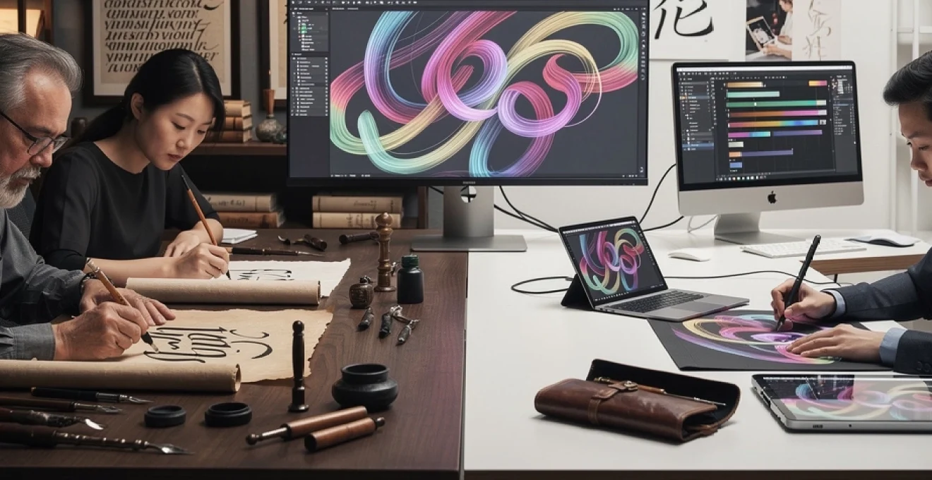
Technical methodologies for integrating hand-lettering into digital design workflows
Understanding the aesthetic and historical dimensions of calligraphy is only half the equation; the other half is technical. How do you move from ink on paper to responsive web assets, motion graphics, or scalable brand systems without losing the soul of the original strokes? Modern design workflows need to accommodate both the imperfections that give calligraphy its charm and the precision that digital platforms demand. This is where vectorisation, pressure-sensitive tablets, font engineering, and animation techniques come into play.
For many studios, the process now resembles a hybrid craft: initial concepts are sketched by hand, refined on a tablet, then converted into vector or font formats for systematic use. The tools may be new, but the underlying logic is ancient—start with a controlled gesture, then refine. By consciously structuring your workflow to preserve calligraphic qualities at each stage, you avoid the common pitfall where a lively sketch becomes a lifeless digital asset. Instead, you build design systems that maintain that crucial sense of human touch.
Vectorisation processes using adobe illustrator and fontself for scalable calligraphic assets
Vectorisation is the key step that transforms calligraphic sketches into scalable assets suitable for logos, icons, and custom fonts. Typically, the process begins with scanning or photographing your hand-lettered artwork at a high resolution, then importing it into Adobe Illustrator. From there, you can use either manual tracing with the Pen tool or carefully tuned Image Trace settings to convert raster strokes into Bézier curves. Manual tracing is slower but allows you to decide where to simplify or exaggerate curves—much like carving a sculpture out of stone.
Once you’ve vectorised individual letters or words, tools like Fontself or Glyphs can help you build complete calligraphic typefaces. You map each vector glyph to a keyboard character, define spacing and kerning, and export an OpenType file that can be used across design software. This approach turns one-off hand-lettered experiments into reusable assets for brand identity systems, interface headings, or packaging. The key is restraint: if you over-smooth or over-simplify the curves during vectorisation, you risk losing the very irregularities that made the original calligraphy compelling. Aim for a balance between accuracy and efficiency, keeping the “hand” visible even in precise digital outlines.
Procreate and ipad pro brush dynamics for authentic pressure-sensitive strokes
For many contemporary calligraphers and designers, the iPad Pro combined with apps like Procreate or Adobe Fresco has become the new sketchbook. These platforms simulate traditional media with surprising fidelity, thanks to pressure and tilt sensitivity in tools like the Apple Pencil. You can configure brush settings—such as pressure curves, taper, jitter, and streamline—to mimic pointed pen, broad nib, or dry brush effects. The result is a digital environment where you can iterate quickly while preserving the expressive qualities of analog calligraphy.
One practical advantage of working digitally from the outset is the flexibility it brings to layout exploration. You can test multiple compositions, layer colours, or adjust stroke weight on the fly, without the overhead of scanning and cleaning up inked artwork. For UI designers in particular, being able to export transparent PNGs or layered PSD files directly from Procreate streamlines integration into mockups and prototypes. Think of the iPad as a bridge rather than a replacement: it allows you to practice “modern calligraphy with Procreate brushes” while still drawing on the muscle memory and stroke control cultivated with physical tools.
Opentype features and contextual alternates in custom calligraphic font development
When calligraphic forms are translated into full-fledged typefaces, OpenType features become essential tools for preserving the organic feel of handwriting. Features such as contextual alternates, ligatures, and stylistic sets allow a digital font to simulate variation and nuance. Instead of repeating exactly the same “a” or “t” every time, the font can substitute alternate glyphs based on surrounding letters, reducing mechanical repetition. This is especially important in scripts inspired by Copperplate, Brush Script, or Spencerian, where repeated identical forms would quickly betray the underlying digital grid.
Implementing these features does require more planning: you need to design multiple versions of common letters, create specific ligatures for awkward letter pairs, and test long strings of text to ensure smooth rhythm. Tools like Glyphs, FontLab, or RoboFont make it possible to script some of this behaviour, but the guiding principle remains calligraphic. Ask: how would a skilled scribe naturally connect these strokes? Where would they lift the pen or change angle? By embedding those decisions into OpenType code, you create “modern calligraphy fonts with ligatures” that behave less like static type and more like a responsive writing system.
SVG animation techniques for motion graphics with hand-drawn letterforms
Motion design offers another powerful avenue for integrating calligraphy into contemporary visual communication. SVG (Scalable Vector Graphics) combined with CSS or JavaScript animation libraries enables you to simulate the act of writing directly on screen. By converting hand-lettered wordmarks into vector paths and then animating the stroke-dashoffset property, you can create “handwriting reveal” effects for logos, titles, or interface microinteractions. This approach works particularly well on the web, where lightweight SVG files scale crisply across devices.
For more complex motion graphics, designers often bring vector calligraphy into After Effects, using plugins or expressions to animate strokes as if they were being drawn in real time. The psychological impact is notable: watching letters form triggers a different kind of engagement than seeing static type fade in. It feels more intimate, more human. When used thoughtfully—say, in an app onboarding sequence or a brand video intro—animated calligraphy can set a tone of care and craftsmanship from the very first interaction.
Commercial applications of calligraphy in contemporary brand identity systems
Beyond individual artworks or one-off experiments, calligraphy has become a strategic asset in brand identity design. In an era of saturated markets and algorithmically generated sameness, hand-lettered marks signal uniqueness and human investment. A custom wordmark based on traditional scripts can instantly differentiate a brand from competitors relying on off-the-shelf type. This is why we see calligraphy embedded in everything from boutique coffee brands and fashion labels to global hospitality groups and cultural institutions.
In practice, calligraphy often appears at multiple levels within a brand system. At the top tier, a hand-lettered logotype or monogram provides a signature element that anchors the identity. At secondary levels, calligraphic textures, initials, or pattern motifs derived from letterforms can be applied to packaging, collateral, and digital interfaces. Even if you choose a clean sans serif for functional copy, anchoring the system with a calligraphic core can imbue the entire experience with warmth and character. The key is consistency: a clear set of guidelines on where and how calligraphic elements should appear prevents them from becoming mere decorative noise.
Material innovations: from traditional nibs and sumi ink to digital stylus technology
The tools of calligraphy have expanded dramatically, but the underlying goal remains the same: to translate hand movement into meaningful marks. Traditional materials—broad-edge nibs, pointed steel pens, bamboo pens, and sumi ink—still play a crucial role in training the eye and hand. They force you to pay attention to pressure, angle, and rhythm in a way that no software slider can fully replicate. Many professionals continue to practice with these tools even if their final outputs are entirely digital, because they cultivate a tactile understanding of stroke behaviour.
At the same time, digital stylus technology has opened new possibilities. Devices like the Apple Pencil, Wacom tablets, and Surface Pen provide high-resolution pressure and tilt data, allowing software to simulate everything from ink pooling to dry-brush texture. This convergence means you can experiment with hybrid workflows: sketch initial concepts in sumi ink, refine on an iPad, and finalise in vector. For designers, the question is less “analog or digital?” and more “which combination of tools best supports the concept?” By treating nibs, brushes, and styluses as complementary rather than competing, you can adapt your toolkit to each project’s aesthetic and production needs.
Educational frameworks preserving calligraphic heritage in modern design curricula
As design education evolves to address emerging technologies, there’s a risk that foundational skills like calligraphy and hand-lettering might be sidelined. Yet many leading programs recognise that understanding letterform construction by hand is essential to mastering digital typography. Institutions such as the Royal College of Art, Type@Cooper, and various Bauhaus-inspired schools integrate calligraphy modules into their curricula, often in the first year. Students might spend weeks practicing foundational hand, Italic, or brush scripts before touching a font editor or layout app.
This emphasis on “slow practice” pays dividends later. Designers who have felt the resistance of paper, the flow of ink, and the consequences of a misplaced stroke tend to handle spacing, hierarchy, and rhythm more sensitively in digital projects. Outside formal education, workshops, online courses, and community groups keep calligraphic heritage alive for self-taught designers. Here, you can learn not just technique but context—why certain scripts developed, what cultural values they encode, and how to use them respectfully in cross-cultural projects. In an increasingly global design landscape, that historical and ethical literacy is just as important as technical skill.