The intricate relationship between colour and human psychology extends far beyond simple aesthetic preferences, fundamentally shaping how we perceive ourselves and how others perceive us. Every hue, shade, and tone carries profound psychological weight, triggering neurological responses that influence mood, behaviour, and social interactions. In the realm of personal style and fashion, understanding these colour dynamics becomes essential for creating authentic self-expression while navigating professional and social environments effectively.
The science behind colour perception reveals a complex interplay between biological processes and cultural conditioning, where wavelengths of light transform into emotional experiences and social signals. Modern research demonstrates that colour choices in clothing can significantly impact confidence levels, professional success, and personal relationships. This sophisticated understanding of chromatic psychology empowers individuals to make deliberate wardrobe decisions that align with their goals and authentic self-expression.
Psychological colour theory and human perception mechanisms
The foundation of colour psychology rests upon understanding how the human brain processes visual information and translates it into emotional and behavioural responses. This complex system involves multiple layers of neurological processing, from basic wavelength detection to sophisticated cultural interpretation patterns.
Chromatic wavelength processing in visual cortex networks
When light enters the eye, specialised photoreceptor cells called cones detect different wavelengths corresponding to red, green, and blue spectrums. This initial detection process triggers cascading neural responses throughout the visual cortex, where colour information becomes integrated with memory, emotion, and cultural associations. The speed of this processing is remarkable – the brain can distinguish between millions of colour variations within milliseconds, creating instant psychological responses before conscious thought occurs.
Research indicates that certain wavelengths trigger more intense neurological activity than others. Red wavelengths, for instance, stimulate the sympathetic nervous system, increasing heart rate and alertness levels. This biological response explains why red clothing often feels empowering or attention-grabbing, creating measurable physiological changes in both the wearer and observers.
Opponent process theory and hering’s colour vision model
The opponent process theory provides crucial insights into how colour combinations affect visual perception and psychological comfort. This model suggests that colour perception operates through three opponent channels: red-green, blue-yellow, and black-white. Understanding these relationships becomes essential when creating harmonious colour palettes that feel psychologically balanced and visually pleasing.
The theory explains why certain colour combinations feel naturally harmonious whilst others create visual tension or discomfort. For personal styling applications, this knowledge enables more sophisticated colour pairing decisions that support rather than undermine the wearer’s psychological state and social objectives.
Emotional colour associations through cultural conditioning
Cultural conditioning plays a pivotal role in determining emotional responses to specific colours, creating learned associations that vary significantly across different societies and historical periods. Western cultures typically associate white with purity and new beginnings, whilst many Eastern cultures connect white with mourning and endings. These cultural frameworks profoundly influence how colour choices in clothing are interpreted within social contexts.
Professional environments often develop their own colour conventions, where navy blue signals trustworthiness and competence, whilst bright colours might suggest creativity or approachability. Understanding these cultural codes enables more strategic wardrobe choices that align with specific professional or social objectives whilst maintaining personal authenticity.
Neurological response patterns to saturated versus muted tones
The saturation level of colours – their intensity or purity – triggers distinctly different neurological responses that affect mood and behaviour patterns. Highly saturated colours stimulate higher levels of brain activity, often associated with increased energy, attention, and emotional arousal. These vibrant tones can feel invigorating and confidence-boosting, but may also become overwhelming in certain contexts or for extended periods.
Conversely, muted or desaturated tones produce calmer neurological responses, promoting relaxation and contemplative states. These subdued colours often feel more sophisticated and timeless, making them excellent choices for professional environments or situations requiring sustained focus and collaboration.
Chromotherapy principles in fashion psychology and wardrobe selection
Chromotherapy, the therapeutic use of colour to influence psychological and physical well-being, offers valuable insights for strategic wardrobe development.
When applied to fashion psychology, chromotherapy encourages us to use clothing as a subtle, daily form of mood regulation. Rather than treating outfits as purely aesthetic choices, you begin to see garments as tools: specific colours can be selected to energise a low morning, calm pre‑presentation nerves, or reinforce a sense of authority and grounded confidence. This perspective does not replace medical or therapeutic support, but it can complement well-being practices by aligning your visible appearance with your internal needs and intentions.
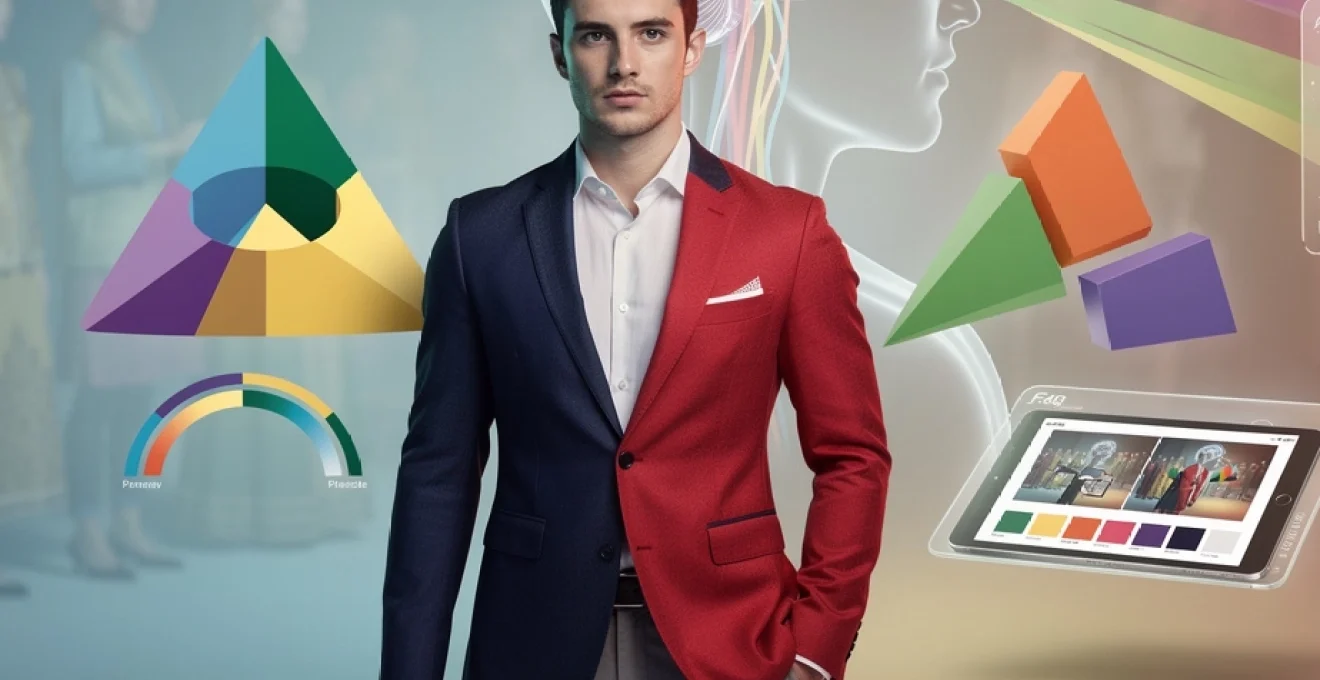
Power dressing through strategic red and navy blue implementation
Within chromotherapy-inspired styling, red and navy blue function as two powerful yet distinct psychological tools. Red is linked to action, visibility, and physiological arousal, making it ideal for situations where you want to be noticed, remembered, or perceived as assertive. This might translate into a red blouse for a keynote talk, a tie with red accents for a negotiation, or a red lip that anchors an otherwise neutral look.
Navy blue, by contrast, is the colour of measured authority and reliability, associated with competence and trust. It lacks the potential aggressiveness of pure black while still signalling seriousness, which is why navy suits dominate legal, financial, and corporate environments. Combining navy as the base with precise red accents allows you to project both stability and dynamism: navy reassures, while red injects momentum and confidence into your visual presence.
Strategic power dressing involves calibrating the proportion of these colours to the context. In conservative settings, you might rely on navy as the primary colour with minimal red details—perhaps a pocket square or subtle jewellery. In more creative or informal environments, you can increase red’s surface area without undermining credibility, using dresses, knitwear, or outerwear to make a stronger statement whilst still grounding the outfit with navy, charcoal, or soft neutrals.
Seasonal colour analysis using munsell colour system classifications
Seasonal colour analysis, popular in personal styling, can be translated into more technical language using the Munsell colour system. Rather than simply labelling someone as “Spring” or “Winter”, Munsell breaks colour down into three measurable dimensions: hue (the basic colour family), value (lightness or darkness), and chroma (saturation or intensity). This allows for more precise wardrobe planning that respects both skin tone and psychological comfort.
For example, a typical “Summer” palette in seasonal analysis often corresponds to cooler hues with medium value and low-to-medium chroma—think dusty blues, soft mauves, and smoky greens. In Munsell terms, these are colours with cooler hue angles, higher values, and reduced chroma, which tend to flatter skin with cool undertones and subtle contrast. An “Autumn” palette, by contrast, leans towards warmer hues with lower value and richer chroma, such as olive, rust, and deep teal, supporting warm undertones and stronger facial features.
Using the Munsell approach, you can audit your wardrobe more objectively. Does your current clothing cluster around deep, low‑value hues that might be visually heavy for your complexion? Are you drawn to high‑chroma brights that feel exciting on the hanger but overwhelming on your body? Mapping your existing garments against value and chroma scales helps you gradually refine your collection towards colours that harmonise both visually and psychologically.
Undertone matching techniques for cool and warm skin palettes
Effective use of colour in personal style begins with understanding your skin’s undertone, which remains relatively stable even as your surface tone shifts with tanning or ageing. Cool undertones often display hints of blue, pink, or rosy hues, whereas warm undertones lean towards golden, peach, or olive shades. Neutral undertones sit between these categories, tolerating a broader range of colours without strong clashes.
A practical technique is to compare how silver versus gold jewellery looks against your skin in natural light. If silver appears crisp and flattering while gold feels heavy or yellowing, you are likely cool‑toned; the reverse suggests a warm undertone. You can apply similar tests with fabric swatches in pure blue (cool) and tomato red (warm) to observe which option makes your complexion appear clearer, more even, and more awake.
Once undertone is identified, you can fine‑tune your wardrobe: cool skin typically harmonises with blue-based reds, jewel tones, and icy pastels, while warm skin glows in earthy neutrals, warm greens, and golden yellows. Importantly, this is not about rigid rules but probability—if you adore a colour that technically sits outside your ideal palette, you can still wear it away from the face, in accessories, footwear, or prints that dilute any harsh effect.
Psychological impact of monochromatic versus analogous colour schemes
The structure of your colour combinations can be as psychologically influential as the hues themselves. Monochromatic schemes use variations of a single hue (for example, multiple blues of differing values and chromas), creating a cohesive, elongating effect. This approach communicates clarity, minimalism, and control, which is why all‑black, all‑navy, or tonal beige outfits feel so composed and professional.
Analogous schemes, by contrast, draw from neighbouring hues on the colour wheel—such as blue, blue‑green, and green—resulting in a more nuanced, visually rich effect that still feels harmonious. These combinations tend to evoke creativity and approachability, offering more visual interest than strict monochrome while avoiding the strong contrast of complementary pairs.
From a fashion psychology perspective, monochromatic dressing is particularly effective when you want to reduce visual noise and focus attention on your message, expertise, or facial expressions. Analogous schemes are helpful when you wish to appear open, imaginative, or collaborative, such as in brainstorming sessions or client‑facing creative roles. Ask yourself: does today require streamlined authority or a softer, more fluid presence? Your colour structure can quietly answer that question for you.
Cultural colour symbolism across global fashion markets
As fashion becomes increasingly globalised, understanding cultural colour symbolism is crucial for anyone whose style operates across borders—whether in international business, digital presence, or travel. Colours that feel neutral or celebratory in one context can carry heavy, even conflicting meanings elsewhere. This does not mean avoiding expressive colour, but rather choosing with informed awareness.
For instance, red appears throughout global fashion yet carries multiple layers of symbolism: in China it signifies luck, prosperity, and celebration, while in many Western contexts it can signal passion, danger, or dominance. White reads as bridal and pure in much of Europe and North America, yet represents mourning in parts of East and South Asia. Black, widely accepted as sophisticated and slimming in Western fashion, is linked more strongly to grief in some cultures and may feel inappropriately somber for joyful events.
For professionals working in diverse markets, it is wise to research local colour customs before high‑stakes appearances such as product launches, diplomatic meetings, or public talks. A capsule wardrobe that leans on adaptable neutrals—navy, charcoal, soft grey, and warm taupe—provides a safe base that can be accented with carefully chosen colours aligned to the region’s symbolism. This approach allows you to honour cultural expectations without sacrificing your core style identity.
Colour temperature dynamics in personal branding and professional image
Colour temperature—whether a hue reads as visually “warm” or “cool”—is one of the most powerful levers in personal branding. Warm colours (reds, oranges, yellows, warm browns) tend to project energy, sociability, and approachability, while cool colours (blues, greens, cool purples, greys) communicate calm, precision, and distance. In professional image-making, the balance between these two families shapes how others experience you long before you speak.
If your role requires high trust and clear decision‑making—such as finance, law, or healthcare—leaning into cooler palettes anchored by navy, slate, and forest can reinforce perceptions of competence and stability. Complementing these with very small injections of warmth, like a burgundy tie or camel coat, prevents the image from becoming too detached or aloof. Conversely, in people‑centric roles like coaching, teaching, or sales, slightly warmer palettes featuring terracotta, soft coral, or warm beige can signal empathy and accessibility while still looking polished.
When building a personal brand online, colour temperature also needs to remain consistent across clothing, photography, and graphic design. A LinkedIn profile picture in icy blue and charcoal will send a very different subconscious message from an Instagram feed filled with sunlit ochres and sage green. To avoid mixed signals, define three to five brand colours—including at least one cool and one warm tone—that reflect the blend of authority and approachability you want to convey, then repeat them deliberately in your wardrobe and digital presence.
Advanced colour harmony techniques for capsule wardrobe development
Creating a capsule wardrobe that feels both versatile and expressive requires more than simply choosing “neutrals plus a few colours.” Advanced colour harmony techniques allow you to build a compact collection where items combine effortlessly, reducing decision fatigue while still offering psychological variety. Think of your wardrobe like a well-curated palette: each colour has a reason to be there, and each interacts gracefully with the others.
At the core of an effective capsule is a small set of base neutrals aligned with your undertone and lifestyle—perhaps navy and stone for cool complexions, or camel and warm charcoal for warmer ones. Around this, you can layer harmonised accent colours using triadic, complementary, split‑complementary, and tetradic relationships. These frameworks ensure that even bolder hues feel intentional rather than chaotic, turning getting dressed into a process of creative assembly rather than daily reinvention.
Triadic colour relationships in statement piece selection
Triadic colour schemes use three hues evenly spaced around the colour wheel—such as red, blue, and yellow, or teal, magenta, and mustard. In pure form, these combinations are bold and playful, often associated with artistic confidence and high visual energy. In a capsule wardrobe, however, you can soften the concept by choosing muted or value‑shifted versions of each hue, preserving harmony without overwhelming the eye.
A practical application might involve selecting one triadic colour as a statement piece and the other two as subtle accents. For example, a deep teal coat can serve as your signature outerwear, supported by a muted mustard scarf and a soft raspberry blouse that rarely appear all together, but remain chromatically connected. This triadic backbone ensures that, over time, your outfits feel cohesive and memorable rather than random.
When choosing triadic relationships for personal style, consider your occupation and comfort with visibility. Extroverted creatives may enjoy wearing all three hues in one ensemble, deliberately leaning into a vibrant, attention‑drawing effect. Those in more conservative environments can restrict triadic play to off‑duty dressing or small details—lining, jewellery, or print motifs—maintaining psychological balance without disrupting workplace norms.
Complementary colour pairing for maximum visual impact
Complementary colours sit opposite each other on the colour wheel, such as blue and orange, red and green, or purple and yellow. When placed side by side, they intensify each other, creating high contrast and visual impact. In fashion, this effect can be powerful but must be handled with care: full-strength complementary combinations can easily tip from dynamic to jarring if not balanced by neutrals or adjusted in value and chroma.
One effective strategy is to choose one complementary colour as the dominant hue and render its opposite as an accent. A navy suit (blue) with a muted burnt orange pocket square, or an olive dress (green) with soft rose‑red earrings, leverages contrast without shouting. Adjusting one of the colours to be darker, lighter, or more muted than its partner reduces strain on the eye while preserving the sense of vibrancy that complementary pairs naturally hold.
Complementary pairing is particularly useful when you want to draw attention to a specific part of the outfit or body. For example, you might keep your clothing within a calm analogous range and introduce a complementary pop in your shoes or bag to create a clear focal point. This intentional use of contrast can guide where observers’ eyes travel first, supporting styling goals such as highlighting your face, showcasing a signature accessory, or elongating the silhouette.
Split-complementary schemes in accessory coordination
Split‑complementary schemes offer a more refined alternative to pure complementary pairing, especially valuable in capsule wardrobes where subtlety and versatility are priorities. Instead of pairing a hue directly with its opposite, you combine it with the two hues adjacent to its complement. For instance, rather than styling blue with orange, you would pair it with yellow‑orange and red‑orange, achieving contrast without such intense opposition.
In practice, this might look like a cool teal blouse accompanied by warm cognac leather accessories and a soft apricot scarf. All three colours interact dynamically, yet the overall impression remains sophisticated rather than loud. Because the accent colours sit closer together, they create a smoother visual transition, which many people find easier to wear in professional contexts.
Accessory coordination is an ideal domain for split‑complementary play. Shoes, belts, bags, and jewellery can all carry adjacent variations of a central hue, tying an outfit together even when the main garments are neutral. Over time, this method allows you to build an accessory capsule that works across multiple seasons and outfits, maximising impact while minimising quantity.
Tetradic colour balance for complex outfit compositions
Tetradic schemes use two complementary pairs—four hues in total—to create rich, layered combinations. For example, blue and orange paired with red and green, or violet and yellow paired with teal and coral. In theory, this offers enormous variety; in practice, it demands careful control of proportion, value, and saturation to avoid visual overload.
Within a capsule wardrobe, tetradic harmony works best when one or two hues are designated as dominant and the others relegated to minor roles. You might, for instance, base most of your outfits around navy and forest green, reserving coral and soft yellow for occasional accents in prints, linings, or seasonal pieces. This way, the wardrobe retains depth and flexibility without becoming chaotic.
Think of tetradic schemes as orchestras: not every instrument plays at full volume all the time. By modulating which colours take the lead in any given outfit, you can tell different style stories—more serious, more playful, more formal—whilst still remaining within a coherent chromatic system. This advanced level of colour planning is particularly powerful for frequent travellers or public figures who need numerous looks built from a limited number of pieces.
Digital colour matching technology and virtual styling applications
The rise of digital colour matching tools has transformed how we approach personal style, making sophisticated colour analysis accessible beyond specialist studios. Smartphone apps, online platforms, and retailer technologies now use camera input and algorithms to estimate your undertone, identify harmonious palettes, and even simulate how specific garments will look against your skin. While not flawless, these tools can provide a valuable starting point for refining your wardrobe.
Virtual styling applications increasingly integrate augmented reality, enabling you to “try on” colours through live filters or uploaded photos. This can be particularly helpful when exploring shades you would not normally consider—such as a cooler green or a warmer beige—before committing to purchase. Many platforms allow you to save preferred combinations, effectively building a digital capsule wardrobe that you can reference while shopping, whether online or in-store.
However, technology works best when paired with critical observation. Lighting conditions, screen calibration, and camera quality can all distort colour perception, so it is wise to cross‑check digital recommendations in natural light and, where possible, with fabric samples. Ultimately, digital tools should support, not replace, your own sensory judgement: use them as a laboratory for experimentation, then verify what truly feels aligned when you see the colours on your body. As we blend neuroscience, cultural insight, and digital innovation, colour becomes not just a visual choice but a strategic language for shaping perception and personal style.