The success of any renovation project hinges significantly on the colour choices you make throughout your home. Beyond mere aesthetic appeal, the right colour palette can transform spatial perception, influence mood, and create a cohesive design narrative that enhances both property value and daily living experience. Professional interior designers understand that colour selection requires a strategic approach, balancing technical considerations with psychological impact whilst maintaining architectural integrity.
Modern renovation projects demand sophisticated colour planning that goes beyond personal preference. The interplay between natural light conditions, architectural features, and intended functionality creates complex decision-making scenarios. Expert colour selection involves understanding how different hues perform under varying lighting conditions, how they interact with existing materials, and how they contribute to the overall spatial experience. Professional-grade paint systems offer enhanced durability and colour accuracy, making informed selection crucial for long-term satisfaction.
Understanding colour theory fundamentals for interior design applications
Effective colour selection begins with mastering fundamental colour theory principles that govern how hues interact within residential spaces. The traditional colour wheel provides the foundation for understanding relationships between primary, secondary, and tertiary colours, but modern interior design applications require deeper knowledge of colour temperature, saturation, and luminance values. Professional designers utilise these principles to create harmonious schemes that support architectural features whilst enhancing spatial functionality.
Contemporary colour theory extends beyond basic complementary relationships to encompass psychological responses and cultural associations. Research demonstrates that colour choices directly impact cognitive function, emotional well-being, and spatial perception. Warm undertones tend to create intimate, welcoming environments, whilst cool undertones promote clarity and expansiveness. Understanding these relationships enables informed decision-making that aligns colour choices with intended room functions and desired atmospheric effects.
HSV colour model analysis for Room-Specific applications
The HSV (Hue, Saturation, Value) colour model provides precise control over colour selection for interior applications. Hue represents the pure colour, saturation determines intensity, and value indicates lightness or darkness. This model proves particularly valuable when matching colours across different lighting conditions or when specifying exact colour requirements for professional paint mixing. High saturation colours create dramatic focal points but require careful balance to avoid overwhelming smaller spaces.
Professional colour matching relies heavily on HSV specifications to ensure consistency across different paint batches and surface types. When renovating multiple rooms, maintaining consistent saturation levels creates visual cohesion whilst allowing hue variations. Value adjustments prove particularly important for addressing lighting challenges, with lighter values compensating for insufficient natural light and deeper values adding intimacy to oversized spaces.
Complementary and analogous colour schemes in residential spaces
Complementary colour schemes utilise colours positioned opposite each other on the colour wheel, creating vibrant contrasts that energise spaces. These schemes work effectively in social areas where dynamic visual interest enhances conversation and activity. However, complementary relationships require careful modulation through neutral intermediaries to prevent visual fatigue. Professional application typically employs one colour dominantly whilst using its complement as accent opportunities.
Analogous colour schemes employ adjacent wheel colours, producing harmonious, sophisticated results ideal for creating serene environments. These schemes naturally occur in nature, making them psychologically comfortable and timeless. Bedrooms, studies, and relaxation areas benefit significantly from analogous approaches, which can incorporate three to five related hues whilst maintaining visual unity through shared undertones.
Warm versus cool undertones impact on spatial perception
Undertone recognition forms the cornerstone of professional colour selection, dramatically affecting how colours appear under different lighting conditions and how they interact with existing architectural elements. Warm undertones containing red, orange, or yellow influences create cosy, intimate atmospheres that psychologically reduce spatial dimensions. These undertones work exceptionally well in north-facing rooms or spaces requiring enhanced comfort and sociability.
Cool undertones featuring blue, green, or violet characteristics produce expansive, calming effects that psychologically enlarge spaces. Cool undertones prove particularly effective in south-facing rooms with abundant natural light or in areas requiring enhanced focus and concentration. Understanding undertone behaviour enables colour coordination across open-plan layouts whilst maintaining distinct zonal characteristics.
Natural light rendering index (CRI) effects on paint selection
The
Colour Rendering Index (CRI) measures how accurately a light source reveals colours compared to natural daylight, on a scale from 0 to 100. In renovation projects, overlooking CRI can lead to significant discrepancies between how a paint sample appears in the showroom and how it looks on your walls. High-CRI lighting (90+), now widely available in LED formats, enables more faithful colour reproduction, which is critical when investing in premium paint systems and complex, multi-room colour palettes.
When planning a renovation colour palette, assess both natural light and artificial lighting specifications together. North-facing rooms and internal spaces with limited daylight particularly benefit from high-CRI fittings, which reduce the risk of greys appearing flat, whites turning dingy, or subtle undertones becoming muddy. By testing sample boards under the actual CRI conditions of your finished lighting scheme, you can make data-backed decisions that ensure long-term satisfaction with your chosen hues.
Room-specific colour psychology and functionality considerations
Whilst colour theory provides the technical framework, successful renovation projects translate these principles into room-specific strategies that support daily use. Each space in your home has distinct functional requirements, from hygiene and durability in kitchens and bathrooms to restorative calm in bedrooms and flexible atmospheres in living spaces. Professional specification therefore combines colour psychology with product performance, finish selection, and maintenance considerations tailored to each room.
Understanding how premium paints behave in real-life scenarios allows you to select not just the right colour palette for a renovation project, but the right coating system for each substrate. In practice, this means pairing carefully curated hues with products such as Farrow & Ball Estate Emulsion, Dulux Trade Diamond Matt, Zinsser Perma-White, and Crown Trade Clean Extreme, all of which offer specific benefits in terms of scrub resistance, stain repellence, and moisture performance.
Kitchen colour schemes: farrow & ball estate emulsion performance
Kitchens demand colour palettes that balance visual warmth, practical durability, and long-term aesthetic appeal. Farrow & Ball Estate Emulsion, with its rich pigmentation and 2% sheen level, delivers a distinctive chalky, heritage finish that softens strong colours and adds depth to neutrals. This low-sheen quality helps disguise minor surface imperfections, making it especially suitable for older properties or renovation projects where walls are less than perfectly flat.
From a functional perspective, Estate Emulsion is best reserved for kitchen walls that are not in direct contact with heavy grease or steam, such as dining zones or open-plan spaces adjacent to the main cooking area. For splash-prone surfaces behind hobs and sinks, professional designers often specify Farrow & Ball Modern Emulsion or a dedicated kitchen system instead, whilst maintaining the same colour to preserve cohesion. Pairing warm, mid-tone neutrals on the walls with deeper, saturated hues on cabinetry creates a layered scheme that hides everyday wear yet remains timeless.
Bedroom paint selection: dulux trade diamond matt applications
Bedrooms require colour schemes that support rest, regulate evening stimulation levels, and feel visually calm under both natural and artificial light. Dulux Trade Diamond Matt, with its highly durable, stain-resistant formulation, may at first seem more suited to high-traffic areas, but its ultra-low sheen and excellent opacity make it a strong candidate for bedrooms in family homes and rental properties. The matt finish reduces glare, which is particularly beneficial in south-facing rooms that receive intense sunlight during the day.
Psychologically, soft blue-greys, muted greens, and complex off-whites specified in Diamond Matt help create cocooning environments that stand up to practical demands such as children touching walls or frequent furniture reconfiguration. Because the product can withstand repeated cleaning without burnishing, you can confidently specify slightly deeper tones than you might with lower-quality paints, knowing that maintenance will not quickly degrade the finish. Combining a mid-value wall colour with a lighter ceiling value subtly emphasises height, promoting a feeling of openness without losing intimacy.
Bathroom moisture-resistant finishes: zinsser Perma-White analysis
Bathroom colour palettes must be selected with a clear understanding of moisture, condensation, and mould risk. Zinsser Perma-White is a specialist water-based, mould-resistant paint designed for high-humidity environments, making it a robust backbone for bathroom renovation schemes. Available in matt and satin finishes, it can be tinted to a broad range of colours, allowing you to maintain consistency with the rest of your home’s palette whilst gaining significant technical benefits.
The product’s mould-resistance technology is particularly valuable in small, poorly ventilated bathrooms or older properties where original extraction systems are limited. Specifying Perma-White in soft, light-reflective tones such as warm whites, pale greys, or muted aquas maximises perceived space and brightness. For spa-inspired schemes, pairing a low-saturation green or blue-grey on the walls with white sanitaryware and natural stone or wood-effect flooring creates a balanced, hygienic aesthetic that remains easy to clean and resistant to discolouration over time.
Living room accent wall strategies using crown trade clean extreme
Living rooms often serve multiple functions: entertaining, relaxation, and sometimes home working. This makes flexible, resilient finishes especially important, particularly where accent walls or deeper colours are used to zone the space. Crown Trade Clean Extreme is formulated for high-scrub resistance and stain repellence, making it ideal for feature walls behind sofas, TV zones, or high-contact circulation areas where scuffs and marks are inevitable.
Using Clean Extreme for accent walls in rich, mid- to deep-value hues—such as ink blues, forest greens, or complex terracotta tones—allows you to introduce drama without sacrificing maintainability. The rest of the room can then be kept lighter and more neutral, ensuring the overall colour palette for your renovation project remains cohesive and adaptable to future furniture or décor changes. Consider echoing the accent colour in soft furnishings and artwork to reinforce visual continuity in open-plan spaces.
Technical paint specifications and surface preparation requirements
Achieving professional results in a renovation project depends as much on technical specification and preparation as on the colour palette itself. Each substrate—plaster, previously painted walls, woodwork, or masonry—requires an appropriate primer, correct moisture content, and surface repair before any topcoat is applied. Ignoring these fundamentals risks premature failure, patchy sheen levels, and inconsistent colour rendering, even when using premium paints.
For newly plastered walls, most manufacturers recommend a mist coat (typically a thinned-down version of the chosen emulsion) to seal the surface and promote adhesion. Previously glossy or oil-based finishes on woodwork and metal should be thoroughly degreased, lightly abraded, and primed with an adhesion-promoting undercoat before repainting with modern water-based systems. Where staining, nicotine, or water marks are present, stain-blocking primers are essential to prevent bleed-through that would distort the final colour. Investing time in filling, sanding, and dust removal ensures that the refined nuances of your chosen colour palette read clearly and consistently across every surface.
Architectural style integration and period property considerations
Colour selection in renovation projects must also respect the architectural language of the building. Victorian terraces, Georgian townhouses, and contemporary extensions each carry distinct proportions, moulding profiles, and light patterns that interact uniquely with colour. A palette that feels appropriate in a minimal new-build may appear jarring in an ornate period interior, and vice versa. Professional schemes therefore interpret historical precedents whilst accommodating modern living requirements.
Integrating the right colour palette for a renovation project means thinking beyond single rooms to façades, stairwells, and transitional spaces. Staircases, landings, and hallways often provide the visual thread that ties disparate eras together, especially where contemporary extensions meet heritage structures. Here, considered use of a “bridge” colour—often a neutral or mid-tone that appears in both periods—can unify spaces without erasing their individual character.
Victorian terrace authentic colour matching techniques
Victorian terraces typically feature high ceilings, ornate cornicing, and strong architectural rhythms that respond well to richly pigmented, historically informed colours. Authentic colour matching often begins with paint analysis, where existing layers are carefully scraped back to reveal original schemes, or by referencing heritage paint collections that replicate 19th-century formulations in modern products. Earthy greens, oxblood reds, deep blues, and stone-based neutrals frequently align with the Victorian palette.
To adapt these traditional colours for contemporary living, designers may reduce saturation or value to prevent spaces feeling overly heavy, especially in narrower terraced layouts. Using deeper tones on interior doors, skirting, and picture rails whilst keeping walls slightly lighter preserves architectural detail and contributes to a cohesive colour palette for the entire renovation. When restoring fireplaces, staircases, or tiled hallways, colours are often sampled directly from original materials to maintain authenticity.
Georgian property heritage paint standards compliance
Georgian properties, with their balanced proportions, large sash windows, and restrained detailing, call for a more understated, tonally harmonious approach to colour. Heritage bodies and conservation officers often reference specific standards and approved palettes to ensure external and sometimes internal schemes respect the building’s historical significance. Soft stone shades, muted greys, blue-greens, and off-whites with minimal yellowing are typical of the period.
Compliance with heritage paint standards may involve specifying low-sheen or lime-based products that allow the building fabric to breathe, particularly on original lime plaster or masonry. Internally, a simple hierarchy—slightly deeper colours on lower floors, progressively lighter tones on upper storeys—can emphasise natural light progression and respect historical usage patterns. When planning a full-house colour palette for a Georgian renovation project, maintaining consistent undertones across all neutrals ensures that bolder accent colours on doors, shutters, or stair spindles feel deliberate rather than intrusive.
Contemporary extension colour coordination methods
Where contemporary extensions interface with period properties, colour becomes a crucial mediator between old and new. Rather than attempting to mimic historical colours exactly in modern forms, many architects favour a complementary strategy: referencing the hue family of existing materials whilst simplifying and clarifying it for the new volume. For example, a contemporary kitchen extension might pick up the warm stone tones of a Georgian façade in a sleeker, cleaner neutral for internal walls and cabinetry.
Using a restrained palette in the extension—often one or two main hues plus a contrasting material such as black-framed glazing or natural timber—prevents visual competition with original rooms. Repeating at least one element of this modern palette (perhaps the window frame colour or timber tone) in transitional areas like hallways and stairwells creates continuity. This approach allows you to enjoy the crispness of a contemporary design language whilst maintaining a coherent overall colour palette for your renovation project.
Listed building consent requirements for exterior colour changes
For listed buildings, exterior colour changes are rarely a purely aesthetic decision. Local authorities and heritage organisations typically require Listed Building Consent for any alteration that affects the character of the property, and this often includes repainting façades, joinery, and sometimes even front doors. Proposals usually need to demonstrate that chosen colours either replicate historical schemes or are in keeping with the building’s age, materials, and surrounding streetscape.
In practice, this means researching archival photographs, historic paint charts, or neighbouring heritage properties to identify appropriate options. Paint manufacturers with heritage ranges can often provide documentation and sample boards to support planning applications. By aligning your external colour palette with conservation guidelines from the outset, you avoid costly delays and ensure that the renovation project enhances rather than detracts from the building’s protected status.
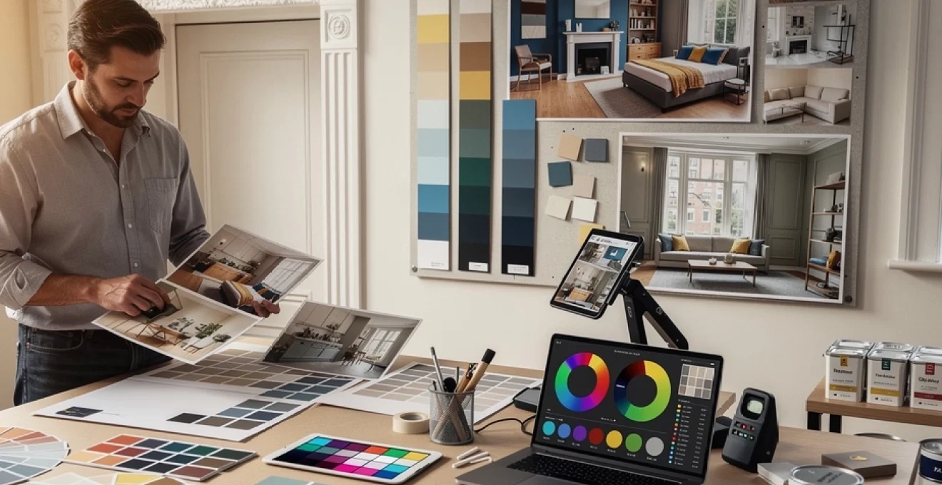
Professional colour matching tools and digital planning software
Advances in digital technology have significantly simplified the process of planning and testing a colour palette for renovation projects. Professional designers increasingly rely on calibrated scanners, digital swatches, and augmented reality tools to visualise how colours will appear across entire properties. These tools reduce guesswork, help maintain consistency across different materials and suppliers, and provide clear visual references for contractors and clients alike.
However, whilst digital previews are invaluable, they should always be complemented by physical sample boards viewed under the actual lighting conditions of the space. Screen settings, device types, and photographic exposure can all distort perceived colour. The most reliable process combines standardised colour systems such as RAL and Pantone with manufacturer-specific technologies from brands like Benjamin Moore and Sherwin-Williams to bridge the gap between digital planning and real-world application.
RAL colour standard implementation for consistent results
The RAL system is a widely used European colour standard that provides numerical references for over 200 core colours, enabling consistent communication between designers, contractors, and manufacturers. In renovation projects, RAL references prove particularly valuable when coordinating different materials—such as metalwork, powder-coated window frames, and external joinery—where exact colour matching is essential. By specifying a precise RAL code, you minimise the risk of subtle but distracting mismatches between components.
Implementing RAL colours within your interior palette can also streamline procurement, especially in commercial-grade or mixed-use renovations. Whilst decorative paint brands may not advertise direct RAL equivalence for every shade, many can approximate or custom-mix to a given code. Maintaining a central record of all RAL references used across a project ensures that future touch-ups, extensions, or repairs can replicate the original scheme with confidence.
Pantone matching system integration with paint manufacturers
The Pantone Matching System (PMS) originated in the print and graphic design industries but increasingly influences interior colour selection, particularly where branding or specific accent colours are involved. Many professional paint suppliers now offer Pantone-to-paint matching services, allowing you to translate a corporate identity or a favourite Pantone accent into durable wall, woodwork, or furniture finishes. This is especially useful in home offices, studios, or mixed residential–commercial spaces.
When integrating Pantone colours into a domestic renovation palette, moderation is key. Strong brand or fashion-led hues often work best as controlled accents—on a front door, feature wall, or piece of joinery—rather than dominant wall colours. Pairing a Pantone-derived accent with more timeless neutrals from traditional paint ranges helps protect your investment from rapid trend cycles whilst still delivering precise, personalised touches.
Benjamin moore colour preview technology applications
Benjamin Moore’s digital colour tools and extensive fan decks allow detailed exploration of subtle tonal shifts, making them particularly valuable for complex renovation palettes where undertone control is critical. The brand’s Colour Preview technology, available through online visualisers and mobile apps, enables you to upload photographs of your rooms and virtually apply different shades, experimenting with relationships between walls, ceilings, and trim before committing to full-scale painting.
For best results, use the digital preview phase to shortlist a manageable number of candidates—typically three to five per room—and then order physical sample pots. Applying these to primed boards that you can move around the space at different times of day offers a far more accurate sense of how the colours will behave. This hybrid approach leverages technology for broad exploration whilst respecting the fundamental truth that real-world light and texture ultimately define how a colour is perceived.
Sherwin-williams ColorSnap visualizer professional usage
Sherwin-Williams’ ColorSnap Visualizer provides another robust platform for planning a renovation colour palette, with features tailored to both professionals and homeowners. The system can match colours from uploaded photographs, enabling you to derive a palette from an existing rug, artwork, or external landscape. It also allows you to build room-by-room schemes that maintain consistent undertones, a crucial factor in ensuring harmony across open-plan layouts and multi-storey properties.
Professionals often use ColorSnap in conjunction with physical fan decks and project specification sheets to create clear, shareable documentation. By exporting selected colours, finishes, and product lines into a schedule, you give decorators and contractors an unambiguous reference that reduces on-site errors. The ability to preview different sheen levels—matt, eggshell, satin, or gloss—within the same hue family further supports nuanced decision-making about how each surface will interact with light.
Budget allocation strategies and cost-effective premium paint alternatives
Finally, even the most refined colour palette for a renovation project must respond to practical budget constraints. Strategic allocation of funds allows you to enjoy the benefits of premium paints where they matter most, whilst using cost-effective alternatives in lower-impact areas. High-traffic spaces, feature rooms, and critical first-impression areas such as hallways and entrance halls typically justify investment in top-tier, scrub-resistant products with superior pigmentation and coverage.
In secondary bedrooms, loft spaces, or utility areas, mid-range trade paints often provide a satisfactory balance between durability and cost, especially when applied over well-prepared surfaces. One effective strategy is to prioritise premium products for darker or more saturated colours—where pigment quality most affects richness and coverage—whilst using more economical options for light neutrals. Buying in larger trade volumes, consolidating orders with a single supplier, and scheduling work to minimise waste from leftover tins all contribute to more efficient use of your paint budget without compromising the coherence or longevity of your chosen colour palette.