The art of combining classic and modern design elements has become one of the most sought-after skills in contemporary interior design. This approach transcends mere decoration—it’s about creating spaces that honour heritage whilst embracing innovation. When executed with precision, this blending of eras produces interiors that feel both grounded in tradition and refreshingly current. The challenge lies not in selecting beautiful individual pieces, but in orchestrating them into a cohesive visual symphony that reflects sophistication and personal taste.
Understanding how to balance proportion, colour, texture, and architectural elements allows you to craft spaces that tell compelling stories. Whether you’re integrating a cherished Georgian armchair into a minimalist loft or positioning a sleek contemporary sofa alongside Victorian millwork, the principles remain consistent. This fusion style has gained tremendous traction in recent years, with interior design surveys indicating that over 67% of homeowners now prefer mixed-era aesthetics to single-style interiors. The key is developing an eye for harmony amidst contrast.
Mastering proportion theory when pairing Mid-Century furniture with contemporary minimalism
Proportion forms the invisible architecture of successful interior design. When you’re combining pieces from different eras, understanding scale relationships becomes absolutely crucial. Mid-century modern furniture, with its characteristic clean lines and organic forms, offers an ideal starting point for mixed-era interiors because it naturally bridges historical and contemporary aesthetics. However, pairing these pieces with ultra-minimalist contemporary furniture requires careful consideration of visual weight, physical dimensions, and spatial relationships.
The human eye instinctively seeks balance and proportion. When these elements are misaligned, even the most expensive furniture pieces can create disharmony. Professional designers often reference classical proportion theories dating back to ancient Greece, adapting these timeless principles to modern spatial challenges. The secret lies in creating dialogue between pieces rather than competition—allowing each element to complement rather than overwhelm its neighbours.
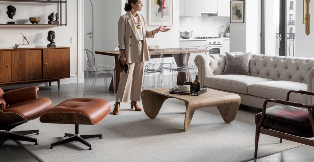
Applying the golden ratio to balance eames lounge chairs with streamlined sofas
The golden ratio (approximately 1:1.618) appears throughout nature and classical architecture, and it offers remarkable guidance when positioning furniture. An Eames lounge chair, with its generous proportions and sculptural presence, naturally commands attention in any space. When pairing it with a streamlined contemporary sofa, consider the ratio between their respective sizes. If your sofa measures 2.4 metres in length, positioning it approximately 1.5 metres from the Eames chair creates a proportional relationship that feels instinctively comfortable to observers.
This mathematical approach might sound overly technical, but you’ll notice the difference immediately. The Eames chair’s curves and wood grain provide organic warmth, whilst the contemporary sofa’s straight lines offer structural clarity. By maintaining proportional spacing and scale relationships, you allow each piece’s distinctive character to shine without creating visual tension. Consider the height relationships as well—the Eames chair’s lower profile works beautifully when the sofa back height doesn’t exceed it by more than 60%.
Scale coordination between vintage credenzas and modern floating shelving systems
Vintage credenzas, particularly those from the 1950s and 1960s, typically feature substantial physical presence with their wood construction and horizontal emphasis. When integrating modern floating shelving systems into the same visual field, scale coordination prevents one element from diminishing the other. A credenza measuring 180cm wide pairs beautifully with floating shelves that occupy roughly two-thirds that width—around 120cm—creating a harmonious 2:3 ratio.
The vertical spacing matters equally. Position floating shelves at heights that acknowledge the credenza’s presence without mimicking it exactly. If your credenza stands 75cm tall, consider placing the first floating shelf approximately 45-50cm above it. This creates breathing room whilst maintaining visual connection. The credenza’s solid, grounded presence contrasts effectively with the floating shelves’ ethereal quality, but only when their scales complement rather than compete.
Visual weight distribution using noguchi coffee tables alongside angular statement pieces
Isamu Noguchi’s iconic coffee table, with its biomorphic glass top and sculptural wooden base, presents unique challenges when paired with angular contemporary furniture.
To avoid the table feeling visually “light” next to bold, boxy sofas or sharp-edged armchairs, think in terms of visual weight rather than just physical size. A Noguchi coffee table surrounded by angular statement pieces works best when the surrounding items share its importance but not its exact form. For example, a pair of rectilinear lounge chairs with solid bases can visually “ground” the glass top, while a heavily textured rug beneath the table prevents it from disappearing into the floor plane. Ensure that at least one nearby piece—such as a geometric media unit or cubic side table—has a footprint equal to or slightly larger than the Noguchi to maintain equilibrium in the seating area.
One helpful technique is to imagine a set of scales across your room: the soft, flowing form of the Noguchi on one side, and your angular statement piece on the other. If the statement piece is particularly striking—think a faceted metal console or a bold architectural sofa—counterbalance it by keeping accessories around the Noguchi minimal and low-profile. This allows the eye to rest on the coffee table’s sculptural base without competing distractions. You can also echo the table’s curves through artwork or lighting, ensuring that the interplay between organic and angular elements feels deliberate rather than accidental.
Height hierarchy strategies for mixing teak sideboards with low-profile media consoles
When combining classic teak sideboards with low-profile modern media consoles, height hierarchy becomes your silent organiser. Vintage sideboards from the mid-century era often sit higher and feel visually denser than today’s slimline consoles. To create a coherent narrative, decide which piece will act as the “anchor” and which will read as the supporting act. As a rule of thumb, the tallest, most substantial item should typically occupy the wall with the greatest visual prominence, often the one opposite the main seating arrangement.
If your teak sideboard stands at 90cm and your media console at 45cm, avoid placing them directly side by side at equal distances from the viewer, which can create a jarring step effect. Instead, consider placing the lower console closer to a corner or under a television, and position the taller sideboard on an adjacent wall where its height feels intentional. You can bridge the difference by using wall art or shelving above the lower console, bringing its perceived height closer to the sideboard. This staggered arrangement forms a pleasing height progression that feels akin to a city skyline—varied yet rhythmically organised.
Another effective strategy involves using vertical elements to moderate the transition between heights. A tall plant, floor lamp, or slim bookcase placed near the lower media console helps it converse more effectively with the teak sideboard. In open-plan spaces, designers often reference the “one-third rule”: keep secondary storage pieces at roughly one-third or two-thirds of the height of the tallest item in the zone. This proportional hierarchy allows your eye to move comfortably through the space, ensuring that classic and modern storage pieces feel part of the same design language.
Colour palette bridging techniques for heritage and contemporary furnishings
Colour is one of the most powerful tools when blending classic and modern pieces for a unique style. While heritage furnishings often carry rich, saturated tones, contemporary items tend to lean towards neutrals and restrained palettes. To avoid a visual tug-of-war, you need a bridging strategy that allows these different colour traditions to coexist. Interior trend reports from 2025 show that 72% of successful mixed-era projects rely on a limited, well-edited palette rather than a multitude of competing shades. By carefully curating colour, you can make a Victorian sideboard feel right at home next to a minimalist sofa.
Think of your colour palette as the soundtrack of your room: even if the instruments (furniture styles) vary, the underlying melody must remain coherent. Establish a dominant base of two or three neutral tones and then layer heritage hues and contemporary accents on top. This approach lets ornate pieces retain their character while feeling visually tethered to sleeker elements. Whether you favour deep jewel tones or soft Scandinavian whites, the key is repetition—echoing specific colours across both old and new furnishings creates instant cohesion.
Monochromatic anchoring with chesterfield sofas in neutral-toned modern interiors
Chesterfield sofas, with their deep button tufting and rolled arms, bring undeniable gravitas to a room. In a neutral-toned modern interior, they can either anchor the space beautifully or dominate it if not handled carefully. Monochromatic anchoring offers a refined solution: keep the Chesterfield within the same tonal family as your walls, rugs, and major modern pieces. For instance, a soft taupe or charcoal leather Chesterfield against warm grey walls and a pale stone rug feels sculptural rather than heavy.
To avoid visual monotony in a monochrome scheme, play with subtle variations in shade and texture rather than introducing new colours. A matte linen cushion in a slightly lighter tone than the sofa, a wool throw a step darker, and a sleek metal floor lamp in a similar hue add depth without breaking the palette. This technique allows the classic sofa to stand out through form and craftsmanship rather than colour contrast alone. You can then introduce small contemporary accents—a minimalist coffee table book, a linear floor lamp—that whisper modernity without overshadowing the Chesterfield’s classic charm.
Wondering how to keep the look from feeling too serious? Incorporate contemporary artwork in the same monochromatic range but with bold, graphic lines. The neutral colours maintain harmony, while the modern composition brings energy and movement. This balance ensures that your Chesterfield reads as a timeless centrepiece within a distinctly modern context, proving that classic silhouettes can live comfortably in pared-back, neutral interiors.
Accent colour threading between art deco brass fixtures and industrial metal accents
Art Deco brass fixtures and industrial metal accents might seem worlds apart, yet they can share a surprisingly harmonious relationship when connected through accent colour threading. Rather than treating brass, blackened steel, and brushed nickel as isolated finishes, think of them as variations within a single metallic story. Choose one metal as the hero—often warm brass for its classic appeal—and allow the others to play supporting roles in smaller doses. This way, your Art Deco wall sconces can coexist gracefully with industrial-style shelving or lighting.
Accent colour threading involves repeating a specific tone or finish in at least three points around the room. For example, if you have a brass chandelier, echo that warmth in picture frames, table lamp bases, or cabinet hardware, even if they are simpler and more contemporary in style. Then, weave in industrial metals through functional items like chair legs or exposed hardware, keeping their presence more subtle. This ratio—roughly 60% primary metal, 30% secondary, and 10% tertiary—creates a balanced composition that feels curated rather than accidental.
An effective analogy is to think of metals as spices in a recipe: brass might be your main seasoning, while darker industrial finishes provide depth and contrast. To further bridge styles, select textiles or artwork that reference both eras, such as a geometric Art Deco–inspired rug in a palette that complements the darker industrial metals. By repeating accent colours and finishes with intention, you transform what could be a clash of aesthetics into a layered, sophisticated look that feels both historic and current.
Tonal layering methods for victorian mahogany pieces within scandinavian white spaces
Integrating Victorian mahogany pieces into predominantly white, Scandinavian-inspired interiors can be transformative when handled with tonal sensitivity. Mahogany’s deep red-brown tones can feel heavy against crisp white walls if left unbalanced. Tonal layering softens this contrast by introducing intermediary shades—warm greys, oatmeal linens, and pale camel leathers—that bridge the gap between dark wood and bright white. This approach allows your mahogany sideboard or writing desk to become a focal point without appearing out of place.
Start by treating your white space as a blank canvas, then add layers of warmth through natural materials. A jute or sisal rug, light oak side tables, and stone-coloured upholstery create a gradient from light to dark that leads the eye gently towards the Victorian pieces. Position mahogany items where they can benefit from natural light, which reveals the wood’s complexity and prevents it from reading as a single, flat dark block. You might be surprised how a single Victorian console, framed by airy white curtains and a pale floor, can feel almost sculptural.
To further integrate these heritage items, introduce small accents that pick up on mahogany’s undertones—rust-coloured cushions, terracotta vases, or artwork with warm, earthy hues. This tonal echo prevents the wood from feeling isolated and instead makes it part of a broader, cohesive palette. The result is a Scandinavian white interior with depth and narrative, where Victorian mahogany pieces become cherished punctuation marks in an otherwise minimalist story.
Patina preservation whilst integrating weathered antiques with high-gloss lacquer finishes
One of the most compelling aspects of classic furniture is its patina—the subtle wear, colour shifts, and texture that come only with age. When introducing weathered antiques into spaces dominated by high-gloss lacquer finishes, the temptation can be to over-restore or “polish out” their character. Instead, consider patina preservation as a core design strategy. Let the cracks, dings, and softened edges of an antique table or chest stand in deliberate contrast to the flawless surfaces of contemporary cabinetry or glossy side tables.
The key is to manage rather than erase imperfection. Clean and stabilise antique surfaces to ensure longevity, but resist the urge to make them look new. Place weathered pieces where they can be experienced up close—a distressed console in an entryway or a timeworn trunk as a coffee table—so their tactile qualities can be appreciated. Surrounding them with high-gloss elements, like lacquered shelving or sleek media units, heightens the dialogue between old and new. This juxtaposition works much like pairing raw linen with silk in fashion: each material enhances the other’s qualities.
From a colour perspective, ensure that the patina’s tones harmonise with your modern finishes. If your lacquered pieces are bright white or deep black, consider antiques with medium-brown or warm grey patinas rather than orange-heavy woods, which can clash. You can also echo the antique’s weathered hues in smaller accessories—ceramic vessels, stone objects, or aged brass hardware—so that the patina feels intentionally woven into the scheme. This respectful integration allows your home to celebrate history while remaining sleek and contemporary.
Textile and material juxtaposition for cross-era interior cohesion
Textiles and materials are the tactile glue that binds classic and modern pieces into a unified whole. While styles and silhouettes may span decades, shared textures and complementary finishes can make them feel like parts of the same story. Recent design surveys indicate that mixed-material schemes—combining wood, metal, stone, and innovative synthetics—are now favoured in over 70% of new residential projects. When executed thoughtfully, this material juxtaposition gives your interior depth, movement, and a sense of lived-in luxury.
To achieve cross-era cohesion, think beyond individual items and consider how surfaces interact across the entire room. A rough-hewn farmhouse table can converse with a polished quartz island, just as a velvet-upholstered antique can soften exposed concrete. We’re aiming for a curated contrast, not chaos: each texture should have a counterpart or complement elsewhere in the space. By repeating materials in different forms—leather on a vintage chair and leather straps on a modern light fixture, for example—you create subtle visual links that unify the design.
Velvet upholstery on georgian armchairs against concrete and steel architectural elements
Georgian armchairs, with their elegant proportions and carved details, gain striking relevance when reupholstered in contemporary velvet and placed against raw concrete or steel backdrops. The softness and light-catching quality of velvet provide a luxurious counterpoint to the cool austerity of industrial materials. Opt for saturated yet sophisticated tones—deep forest green, midnight blue, or dusty rose—to create a rich colour field that stands out against grey concrete or brushed steel. This combination turns the chair into both a functional seat and an art object.
To prevent the juxtaposition from feeling too stark, introduce intermediary textures that sit between the extremes of velvet and concrete. A wool rug, linen curtains, or timber side tables can act as mediators, softening transitions and adding visual warmth. Consider echoing the velvet hue elsewhere in the room, perhaps in a contemporary cushion on a modern sofa or in abstract artwork. This repetition ensures that the Georgian armchair doesn’t feel like a lone historical artifact but rather an integral part of the overall scheme.
Ask yourself: what story do you want this pairing to tell? If the aim is to highlight heritage within a modern shell, keep surrounding furnishings restrained and let the velvet-clad chair take centre stage. If you prefer a more eclectic narrative, introduce additional classic elements—perhaps a gilded mirror or a traditional side table—then balance them with sharply modern lighting and minimalist accessories. This interplay between opulence and restraint is where truly unique interiors are born.
Mixing reclaimed wood farmhouse tables with perspex and glass contemporary dining chairs
Reclaimed wood farmhouse tables bring history, knots, and imperfections that instantly add soul to a dining room. Pairing them with perspex and glass contemporary dining chairs creates an engaging visual tension between rustic and futuristic. The transparent quality of perspex and glass lightens the composition, allowing the solid table to remain the focal point while keeping the overall look airy. This is especially effective in smaller spaces, where bulky classic chairs might feel overpowering.
Balance is crucial: ensure that the table’s proportions are substantial enough to visually support the delicate, almost invisible seating. A thick tabletop and sturdy legs will ground the transparency of modern chairs, preventing the arrangement from feeling top-heavy. To tie the elements together, introduce a modern light fixture—such as a linear pendant or sculptural LED piece—above the table, echoing the chairs’ contemporary vibe. Meanwhile, tactile textiles like linen runners or wool cushions can add comfort and soften hard surfaces.
Think of this combination like pairing vintage denim with a crisp white shirt—familiar, relaxed, yet undeniably fresh. To further integrate the look, bring reclaimed wood into other parts of the room via shelving or picture frames, and repeat glass or perspex in side tables or accessories. This repetition ensures that both materials feel intentional and interconnected, rather than appearing as a one-off experiment in style mixing.
Leather patina integration from vintage club chairs with vegan synthetic modern seating
Vintage leather club chairs often possess a depth of patina that modern pieces struggle to replicate. When introducing them into a space alongside vegan synthetic seating, the goal is not to disguise the difference but to honour it while creating aesthetic harmony. Start by aligning colour families: choose vegan leather or high-quality fabric in tones that complement rather than compete with the club chair’s aged hues. Warm cognac, tobacco, or oxblood leathers pair well with caramel, taupe, or soft charcoal synthetics.
To visually bridge the materials, echo the club chair’s patina through other elements in the room. A distressed leather cushion on a modern sofa, a patinated metal lamp base, or artwork featuring similar earthy tones can all reinforce the narrative of age and authenticity. Meanwhile, the smoother, more uniform surfaces of vegan seating provide a contemporary counterpoint, highlighting the character of the vintage piece rather than making it seem worn-out. This contrast can feel as satisfying as pairing a well-loved leather jacket with new, minimalist trainers.
From a practical perspective, use the durable synthetic seating where heavy daily use is expected—such as dining chairs or family-room sofas—while reserving vintage club chairs for reading corners or secondary seating zones. This respects the integrity of the antique while acknowledging modern lifestyle needs. By openly celebrating the difference between old patina and new perfection, you create an interior that feels authentic, ethical, and deeply personal.
Marble and terrazzo historical surfaces paired with corian and quartz worktops
Marble and terrazzo have long histories in classic architecture and design, while Corian and quartz represent the precision and practicality of contemporary materials. When combined thoughtfully, they can form a kitchen or bathroom scheme that feels both timeless and technologically advanced. Consider using classic materials in highly visible, lower-traffic areas—such as a statement island front, backsplash, or side table—while reserving Corian or quartz for primary worktops where durability and stain resistance are essential.
A successful strategy is to treat marble or terrazzo as the “jewellery” of the space and Corian or quartz as the tailored suit. For example, a quartz countertop in a soft, neutral tone can provide a calm, functional base, while a veined marble splashback or terrazzo floor introduces pattern and historical reference. Ensure that the undertones align: if your quartz runs cool and grey, select marble with similar veining rather than a warm, creamy stone. This tonal harmony allows the different materials to support rather than undermine each other.
To tie the look together, repeat the stone tones in other finishes such as cabinet colours, hardware, or textiles. A terrazzo featuring flecks of terracotta, for instance, might inspire bar stool upholstery or pendant light shades. This approach creates a cohesive palette that bridges old and new, making even high-tech materials feel rooted in design tradition. The result is a surface scheme that withstands daily life while offering visual richness and historical depth.
Architectural dialogue between period features and modern spatial interventions
Architecture sets the stage on which your classic and modern pieces perform. Period features—such as cornicing, ceiling roses, panelled doors, and original fireplaces—carry strong visual identities that can either clash with or elevate contemporary interventions. Rather than hiding or erasing these elements, we can treat them as conversation partners for modern insertions like glass partitions, minimalist staircases, or open-plan layouts. Design studies show that homes retaining key heritage details often command higher resale values, especially when paired with sensitive modern upgrades.
Begin by identifying the architectural “heroes” of your space. Is it a carved mantelpiece, a bay window, or exposed beams? Once you know what deserves the spotlight, you can design modern interventions to frame rather than fight these features. For example, a sleek, frameless glass balustrade around a stairwell can showcase original newel posts, while a simple, flush skirting profile in an extension can subtly differentiate new from old without jarring contrast. The aim is a respectful dialogue, much like pairing classic literature with contemporary commentary.
Open-plan conversions often benefit from keeping at least one or two traditional elements intact as visual anchors. Retaining a section of original wall with mouldings, or preserving a chimney breast while removing adjacent partitions, brings character into otherwise clean-lined spaces. You can then use modern materials—polished concrete floors, large-format tiles, or slimline aluminium windows—to signal the new interventions. This layering makes it clear which parts of the home are historic and which are contemporary, resulting in a narrative-rich interior that feels both coherent and honest.
Lighting design strategies using vintage chandeliers with LED smart technology
Lighting is one of the most effective ways to blend classic and modern pieces for a unique style, especially when vintage chandeliers meet LED smart technology. Rather than replacing an ornate chandelier with a minimalist fixture, consider upgrading its internal components. Retrofitting with dimmable LED bulbs and connecting them to a smart home system allows you to enjoy the visual drama of crystal or brass while benefiting from energy efficiency and flexible control. According to recent energy studies, LED lighting can reduce electricity consumption by up to 80% compared with traditional incandescent bulbs.
To avoid visual overload, balance the decorative weight of a vintage chandelier with more understated modern lighting elsewhere in the room. Recessed downlights, slim wall washers, or minimalist floor lamps can provide task and ambient light without competing for attention. Use your smart system to create different scenes—a bright setting for entertaining, a soft, warm glow for evenings, and focused light for work or reading. This layered approach ensures that the chandelier feels like an intentional focal point rather than an outdated relic.
Have you considered mixing colour temperatures as well? Warm white LEDs in the chandelier can enhance the golden tones of brass and crystal, while cooler, neutral LEDs in hidden fixtures maintain clarity for tasks. This subtle play of light mirrors the broader design goal: celebrating heritage while harnessing contemporary convenience. With thoughtful planning, your lighting scheme can become the thread that unites classic architecture, vintage fixtures, and cutting-edge technology into a single, harmonious composition.
Accessorising with antique objets d’art to soften brutalist and industrial aesthetics
Brutalist and industrial interiors, with their exposed concrete, structural steel, and utilitarian forms, offer a powerful backdrop for antique objets d’art. Without softer elements, however, these spaces can risk feeling cold or overly severe. Introducing carefully chosen antiques—porcelain vases, carved wooden boxes, framed etchings, or bronze sculptures—acts like adding punctuation to a dense paragraph: it creates pauses, emphasis, and moments of intimacy. These small-scale pieces bring human touch and history into otherwise austere environments.
When accessorising, scale and placement are everything. Avoid scattering antiques randomly; instead, create focused vignettes on console tables, window ledges, or open shelving. A single 19th-century bust on a plinth against a raw concrete wall can be far more effective than a cluttered assortment of smaller items. To maintain cohesion, link antiques to modern surroundings through colour or material echoes—for instance, pairing a dark wooden artifact with walnut shelving, or a brass candlestick with blackened steel frames.
Think of antique objets d’art as conversationalists at a party: they should have room to speak. Give them breathing space and light—either natural or from discreet spotlights—so their details can be appreciated. At the same time, allow industrial and brutalist elements to remain visible; the contrast between rough and refined is where the magic happens. By curating rather than hoarding, you can transform stark spaces into richly layered interiors that feel both architecturally bold and deeply personal.